A rebrand with a members’ club appeal
The challenge
Chief Wine Officer (CWO) is a long-running and highly successful wine-tasting event format, aimed at senior executives from the technology world and beyond. The format now successfully spans both virtual and in-person events, but the previous visual identity was not designed with this in mind. The ambition to develop CWO into a fully-fledged brand, with a ‘members club’ feel, and so a rebrand was required to reflect this new reality and new aim.
What we did
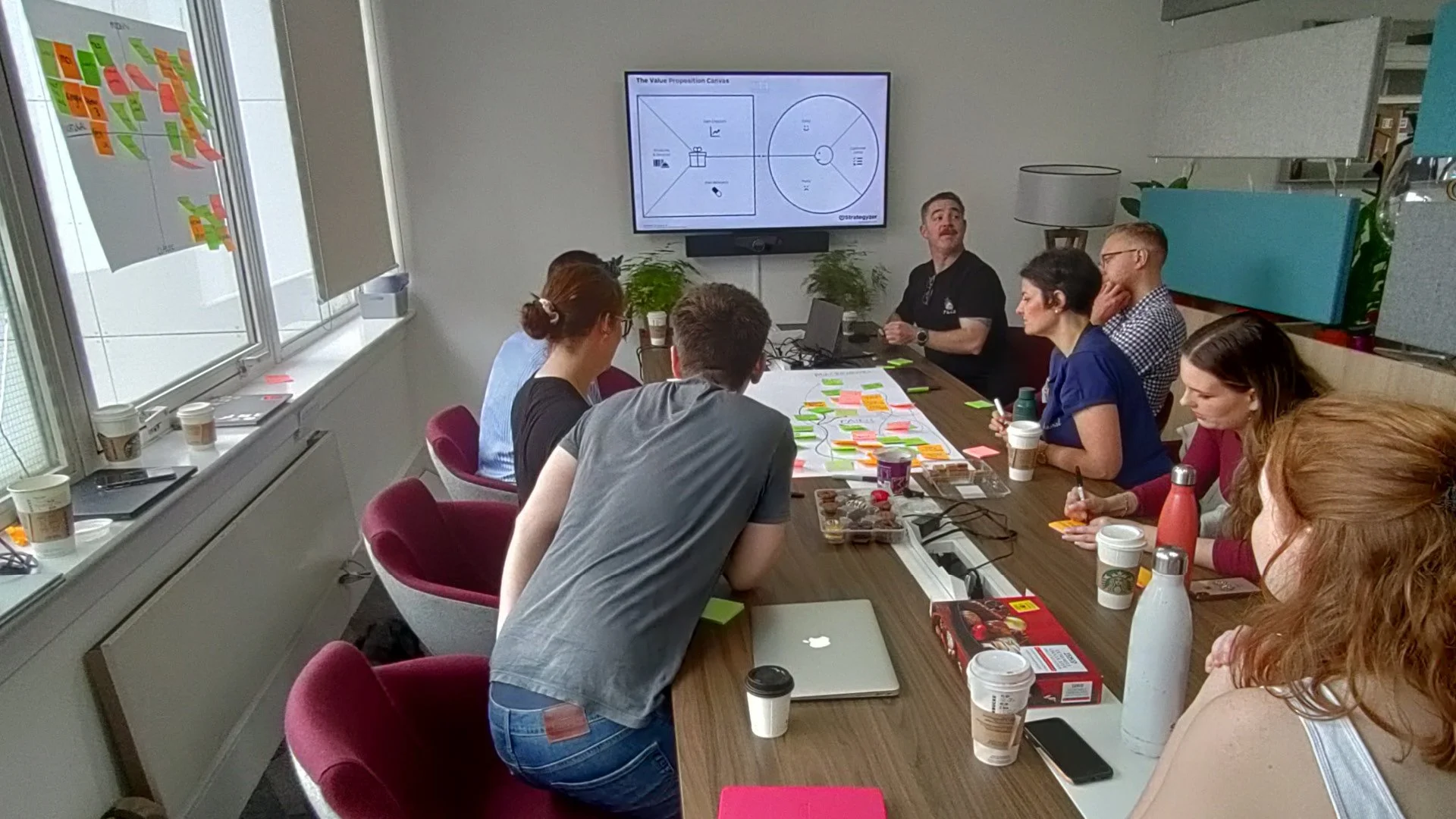
CWO did not have a formal brand positioning document, so after conducting a brand audit and competitor research this was our top priority. We conducted a brand workshop with a wide selection of the Chief Nation team who manage CWO. This generated the raw inputs from which to build the brand positioning.
The core of the positioning, the brand purpose, was deliberately made fairly broad, so as not to limit it over time:
Inspiration, entertainment and community for business leaders
The positioning and research were then used to inform a creative brief and recommendations for the development of the brand’s visual identity. Unique and well-targeted brand positioning benefits many areas of the business, from business strategy, sales and marketing to hiring and shaping the product itself.
We developed three distinct concepts in response to the brief. These were ‘Minimal Baroque’ a minimal style combined with decadent flourishes: ‘Welcome to the Society’ - an imaginary members society building evoking luxury and exclusivity; ‘West Coast Exuberance’ - where Silicon Valley meets the Napa Valley.
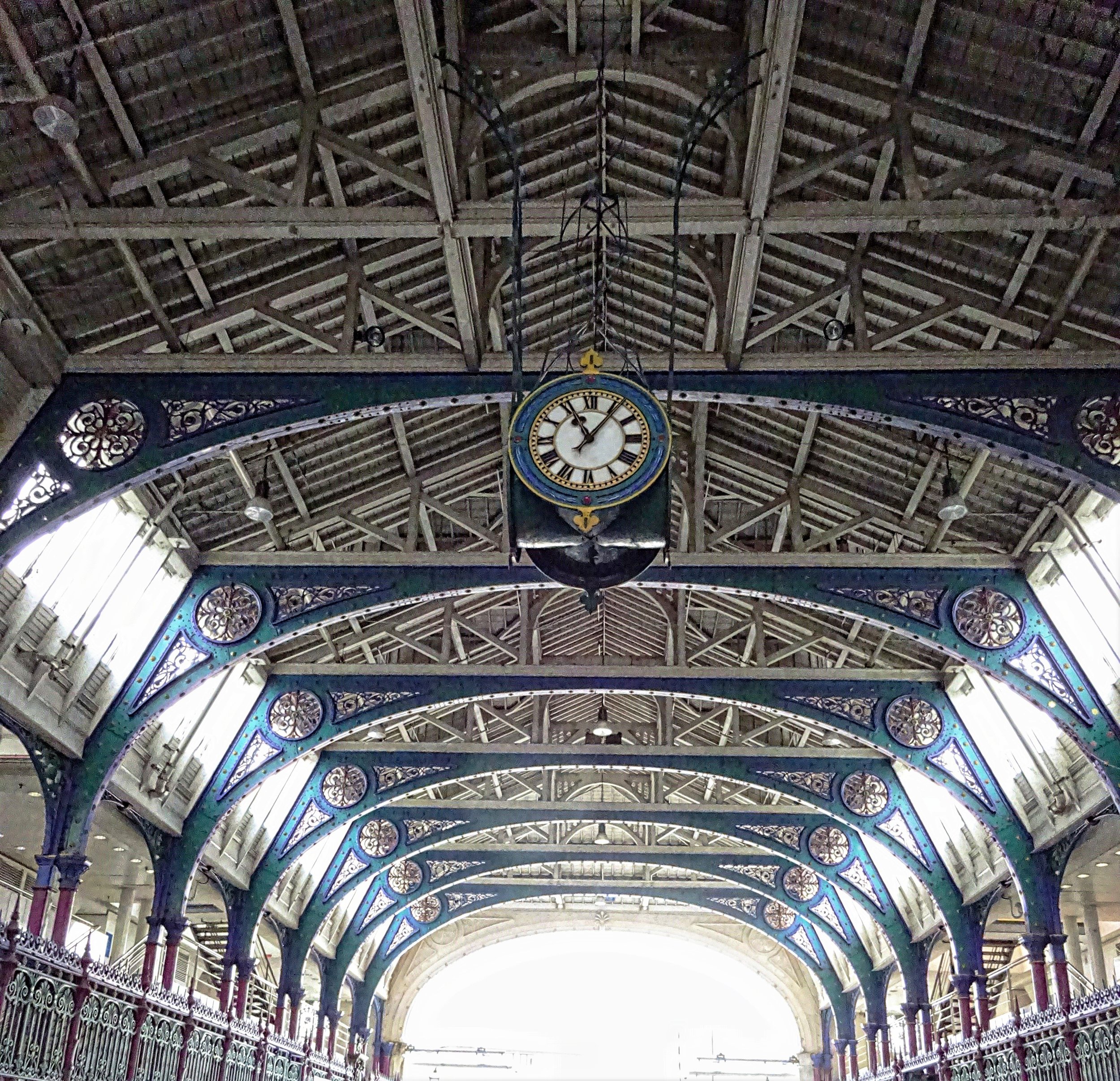
The imaginary building of ‘Welcome to the Society’ evolved into using a real building as the inspiration for the CWO branding. Smithfield Market sits across the road from the Chief Nation office, and the directors suggested using its style to inform the brand design. We researched its history, its multiple architectural styles from Victorian to mid-Century and experimented with architectural details in the logo.
The final logo includes an emblem inspired by the roof of the mid-Century section of the market, which doubles neatly as a representation of the networking which is at the heart of CWO events.
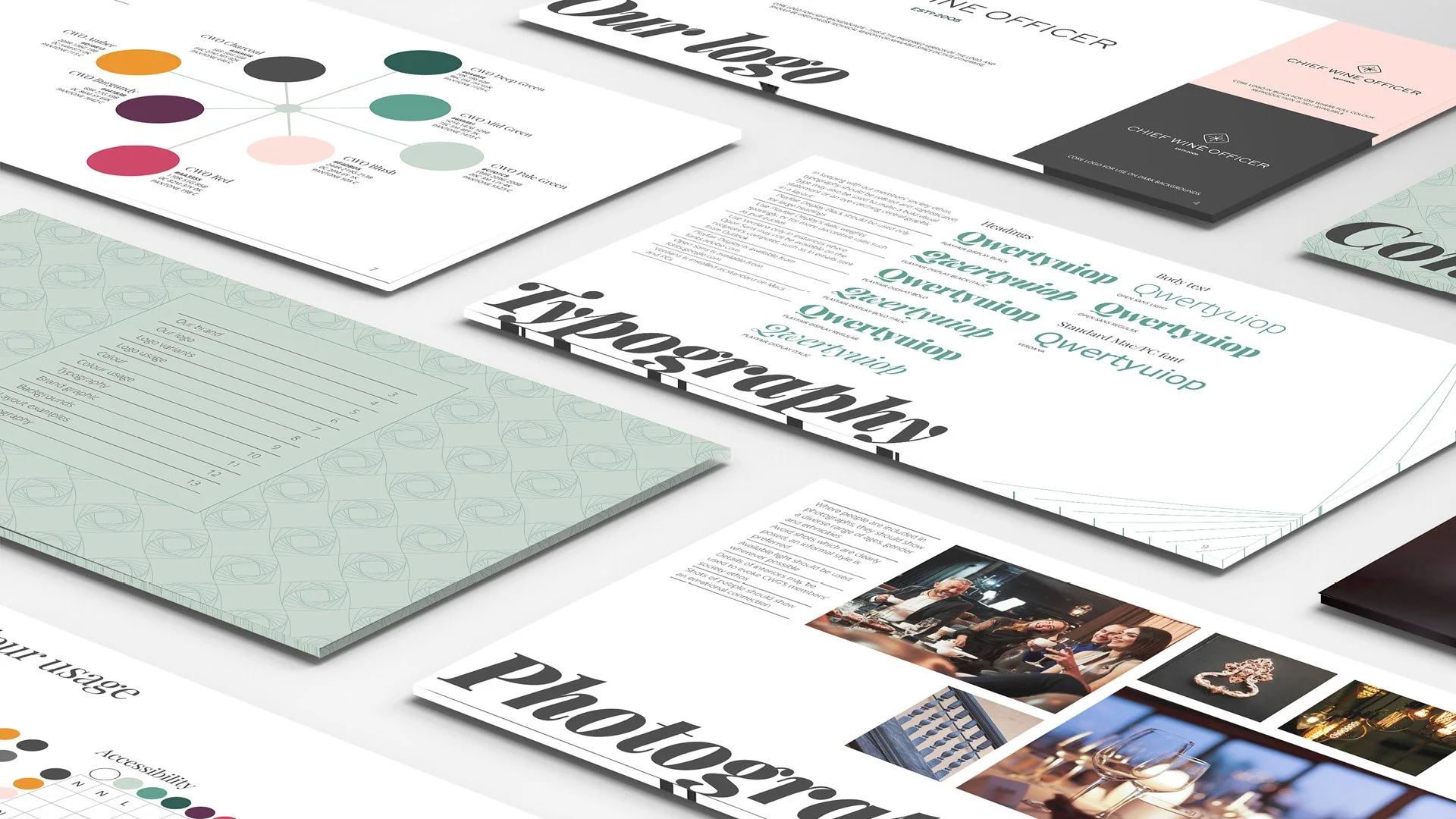
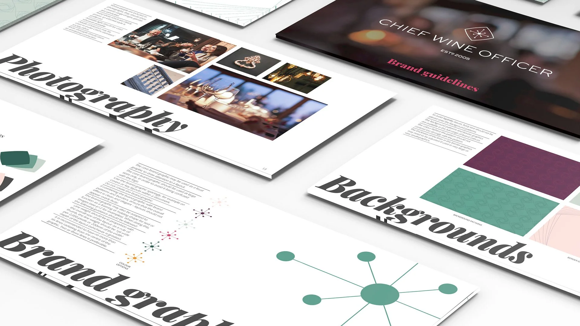
This was then built out into a set of brand guidelines which cover the logo, colour palette, typography and photography guidance as well as a suite of assets including a versatile brand graphic, patterns and backgrounds.
The impact
The Chief Nation team were excited to have the new brand to work with. Chief Nation’s
joint Managing Director and Co-Owner, Craig McCartney had this to say about the project:
“After having worked with Sharp Sharp a number of times, we knew that they know our business, and would integrate well with our team. The brand workshop which Sharp Sharp ran generated a large amount of insights in a short time, and really made the whole team feel involved and invested in the new branding from the start. Fittingly for a brand which is all about community, the end result emerged from a truly collaborative effort!”
The Chief Nation team have used our guidelines and toolkit as a starting point to create a suite of marketing materials which convey a premium feel, and are a refreshing antidote to the more tech-focussed look of their competitors.
CWO’s clients have been impressed with the new look. While it’s early days for the updated brand, the number of visitors to the rebranded website has increased (the Chief Nation team produced the site), which is an encouraging sign.

