Representing human progress: IC Resources brand update
The challenge
International recruiter IC Resources wanted to update their brand to better reflect their pedigree within the tech industry, and to show that they and their talent are at the forefront of this fast-moving field.
The existing branding was well-recognised among its clients, so the update needed to contain visual references to the original.
Our solution
At the heart of every strong brand is a strong piece of brand positioning. After an initial brand audit and visual research, we conducted a brand positioning workshop with a small group of IC Resources staff. The outcomes of this were refined into an inspiring brand purpose:
To be the bridge between the people and the technology companies who are advancing human progress
The rest of the brand positioning, the brand messaging and the visual identity then all flowed from this bold statement.
Initial lettering concepts
The IC initials were used to convey the movement inherent in human progress in a simple way. Each letter is formed from one dynamic stroke progressing from the past to the future.
New logo
The corners are rounded to prevent the brand appearing too clinical, which can easily happen with tech industry branding. Blues form the basis of the colour palette in order to provide continuity with the previous branding. A selection of fresh colours complements this, for use as accent colours, for more informal communications and those aimed at younger audiences.
From an early stage we experimented with ways to render the strokes of the I and C using forces and forms drawn from the world of technology.
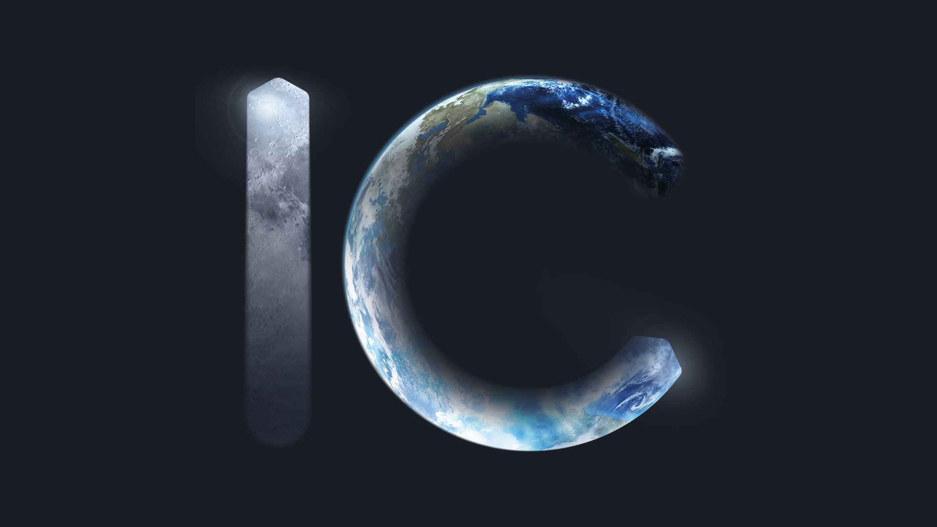
To add relevancy to this abstract concept, it was then applied onto a brand graphics ranging from a light trail drawn by a human finger to the planetary scale of the Earth and Moon revealed within the letterforms.
As is often the case, arriving at the concept was relatively quick, but a lot of time and development was needed to iterate and test the design until the logo details were fully refined.
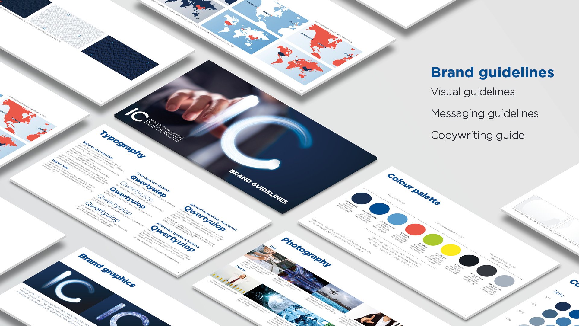
Once the logo was approved, the dynamic ‘IC’ strokes were incorporated into a kit of graphic assets which were then fed into a set of clear, concise brand guidelines.
Alongside the visual work, we developed a practical set of messaging and copywriting guidelines which any employee could refer to, and find examples of communication relevant to them.
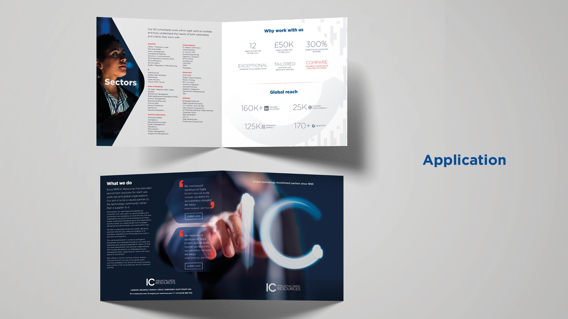
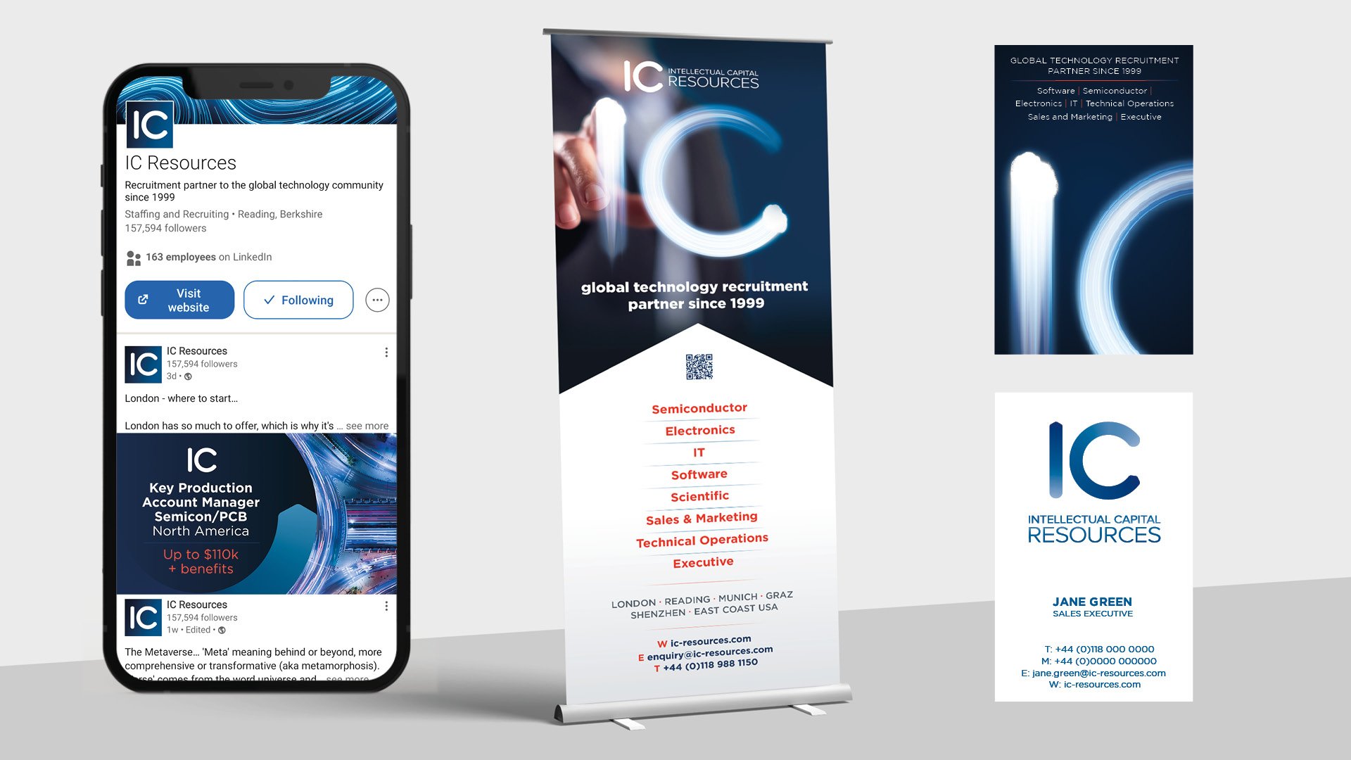
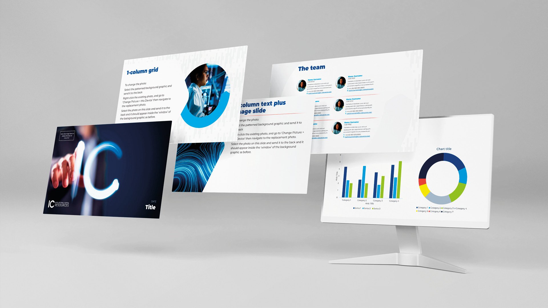
With the brand guidelines completed, we then assisted the IC Resources team with some key applications of the brand. These included digital ad concepts, display graphics, presentations and a brochure.
The results
The new branding has been well received by the IC Resources team.
“We’re delighted with our new branding and it’s been well received across our business. Sharp Sharp’s methodical approach encouraged us to re-evaluate our existing brand positioning. They provided a thorough service with creative flair. This included redeveloping our visual identity, messaging and writing style so that all our brand touchpoints express our vision and values and sit comfortably alongside the innovative organisations we work with.”
Vicky Fellows, Group Marketing Manager, IC Resources
What we delivered
Visual research
Brand positioning and messaging
Brand guidelines including design and communications
Revised logo
Brand assets
Digital ad concepts
Application:
Website copy
Presentation template
Banners, stationery
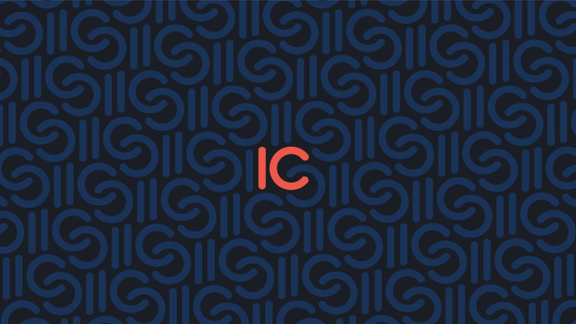
Patterns
Brand graphics
Image selection
Maps
Guidelines
Brochure


