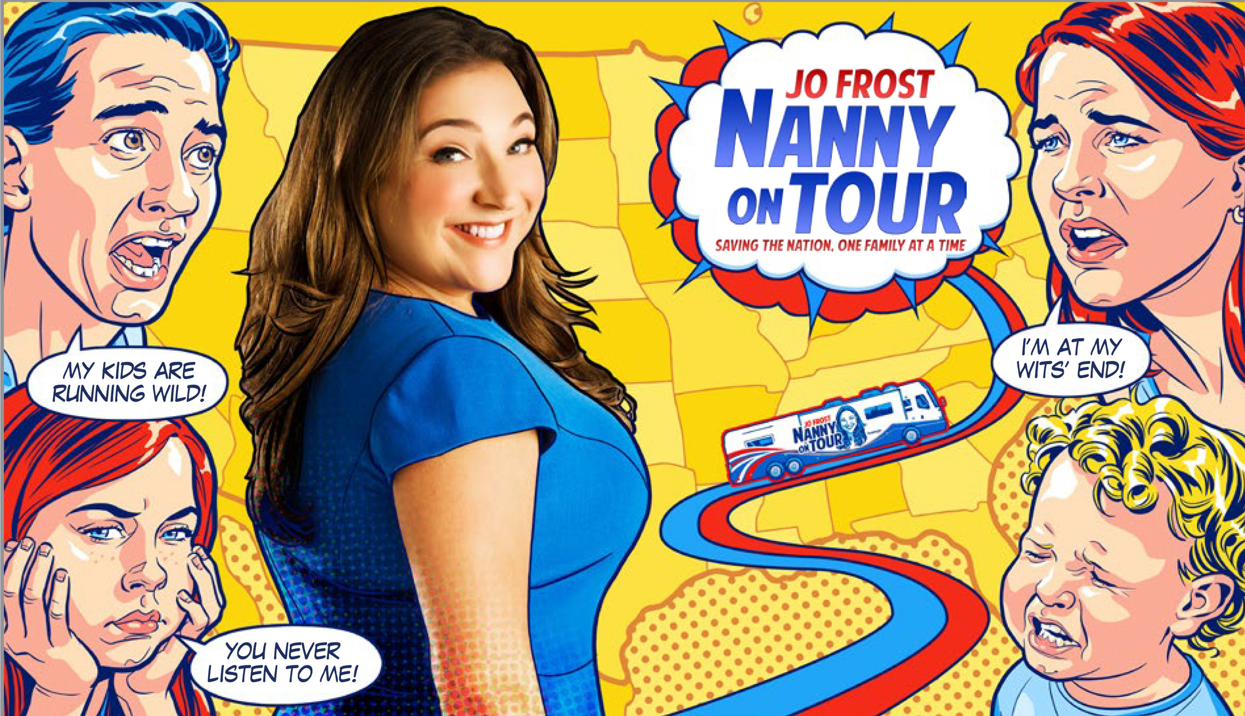
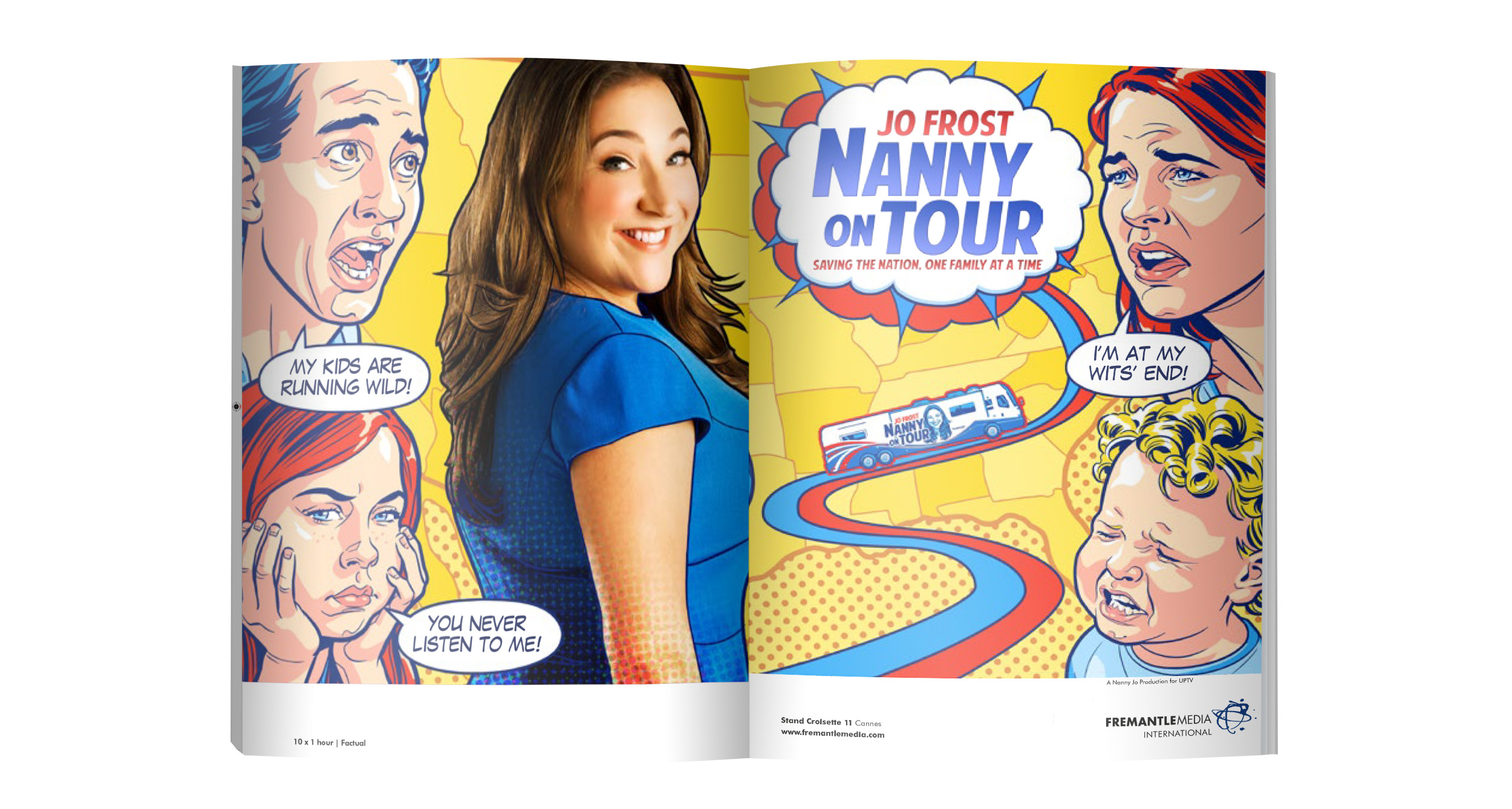
The challenge was to create cut-through for this show with its everyday subject matter, which had to compete for attention at MIPTV against launches of major shows. I developed a pop art illustration style with illustrator Chris Wahl (concept sketches shown right), incorporating bold colours to attract attention plus dramatic close ups of an angst-ridden family.
This is the visual I created and supplied to the illustrator Chris Wahl.
Artwork: © FremantleMedia Limited
Illustrator Chris quickly got a feel for the look I wanted to achieve, and did this black and white sketch before applying colour.
Artwork: © FremantleMedia Limited
After testing out different options, Illustrator Chris and I settled on more naturalistic colours, rather than stylised ones, for the people.
Artwork: © FremantleMedia Limited
The finished artwork in full colour achieved lots of standout with its bright colours and close ups of the angst-ridden family.
Artwork: © FremantleMedia Limited
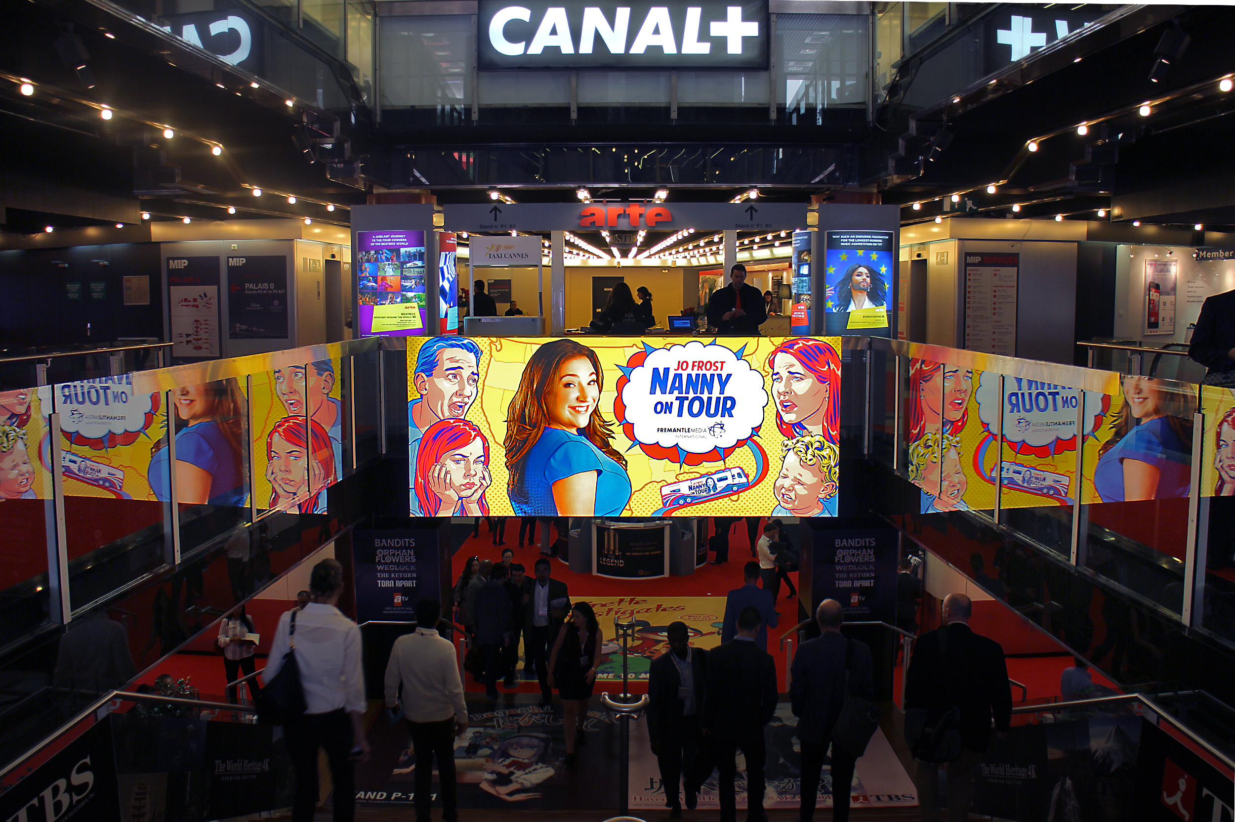
The ad was placed in a lightbox at a prime location, in the entrance to Cannes’ Palais des Festivals for the MIP TV festival.
Artwork: © FremantleMedia Limited
I developed the concept, art directed the illustration and designed the ad.
Artwork: © FremantleMedia Limited
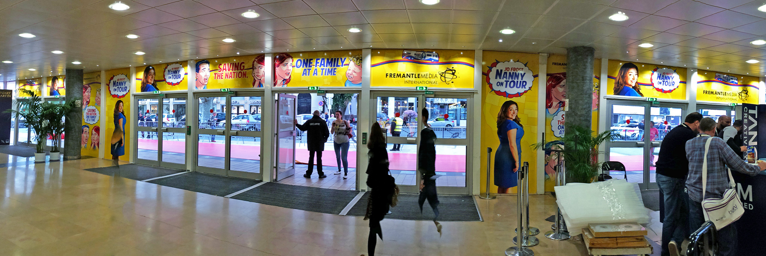
The busy location and difficult lighting and shapes were difficult to work with when designing these advertising panels. In response I kept the layouts simple and the colours bright for maximum impact.
Artwork: © FremantleMedia Limited
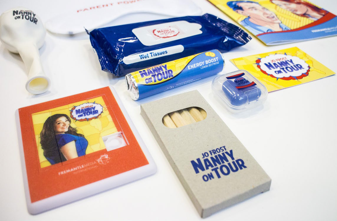
Working closely with my colleagues in the FremantleMedia marketing team, I designed the graphics for this pack to keep kids entertained when travelling.
Artwork: © FremantleMedia Limited