It was a real pleasure to return to the world of furniture in this brochure for Field & Hawken, my longest-standing clients.
Having designed their logo back in 2008 when first launching their business, it’s heartening to see how they’ve grown from an online only store to having a large showroom, and that they have adapted to the economic effects COVID very well so far.
Drawing upon past experience working for homewares and interiors brands Elgin & Hall and CVO Fire, I developed a bold, contemporary look with playful type in order to bring the products to life.
Space on the page was at a premium, and in order to retain a clean look I used photography taken in situ for the larger shots and cleaner cutout images for the smaller spaces.
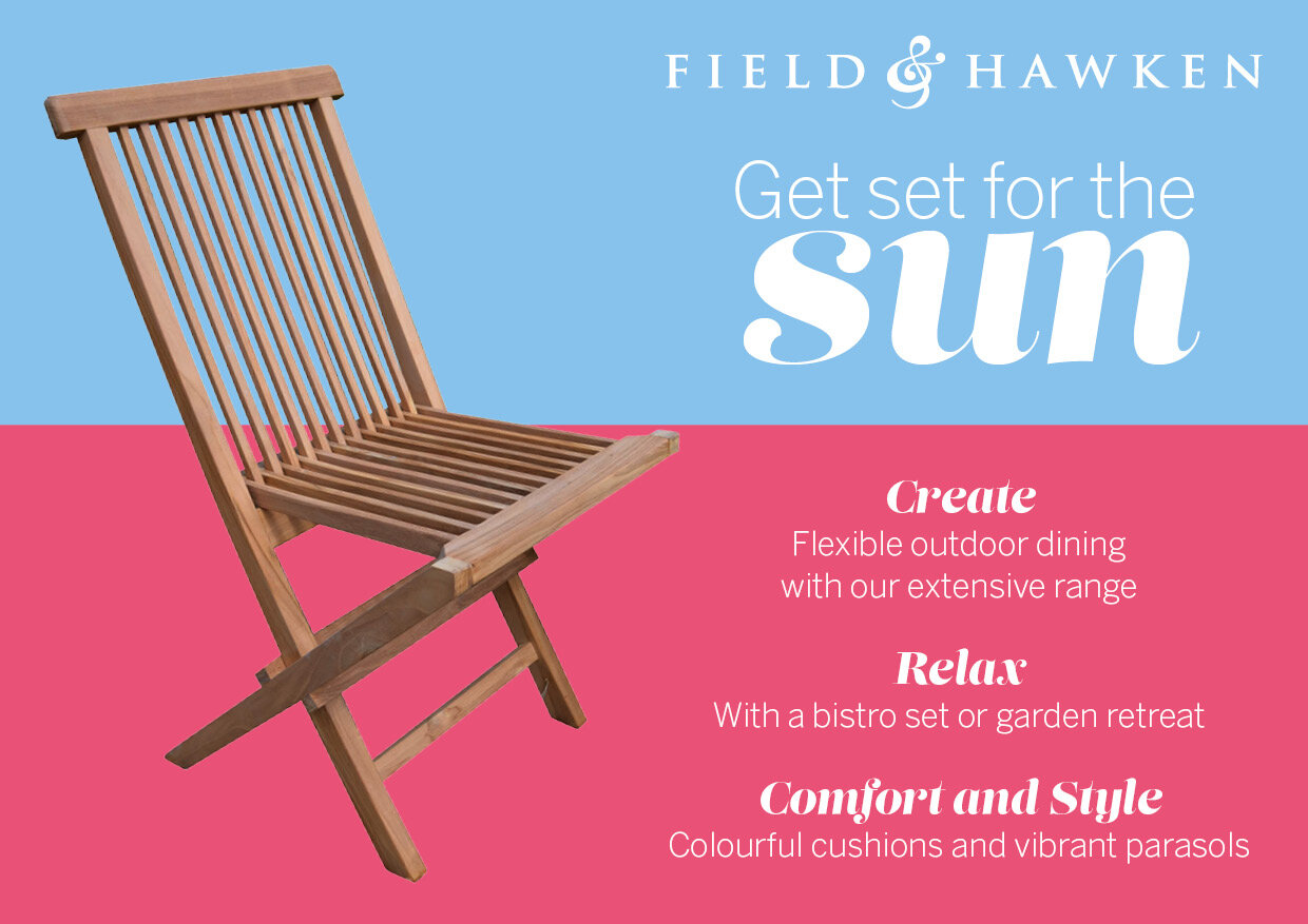
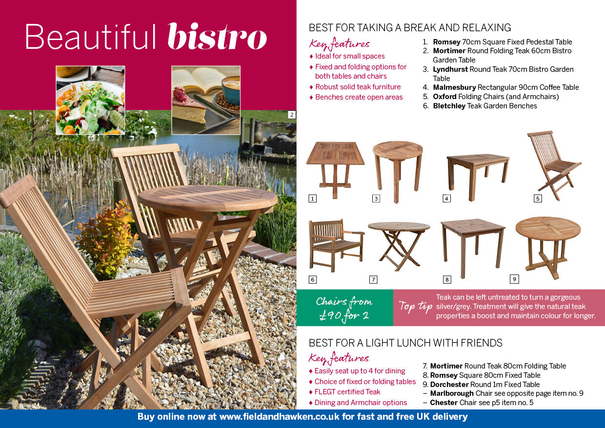
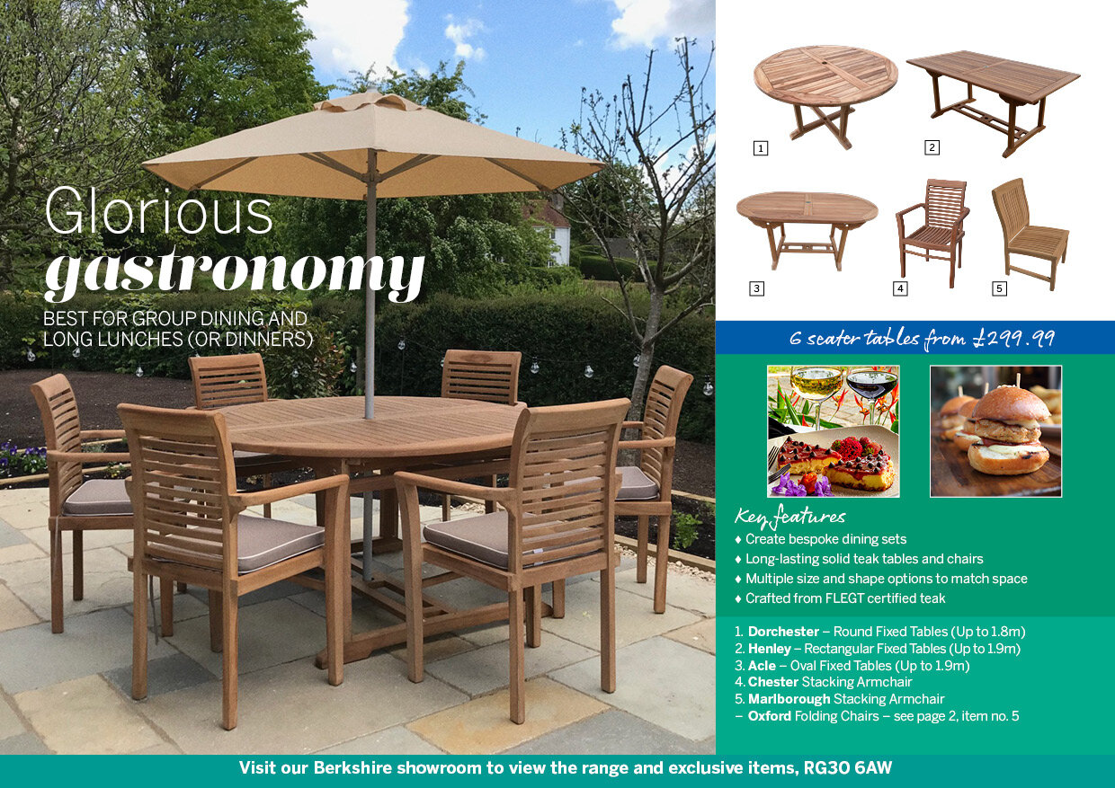
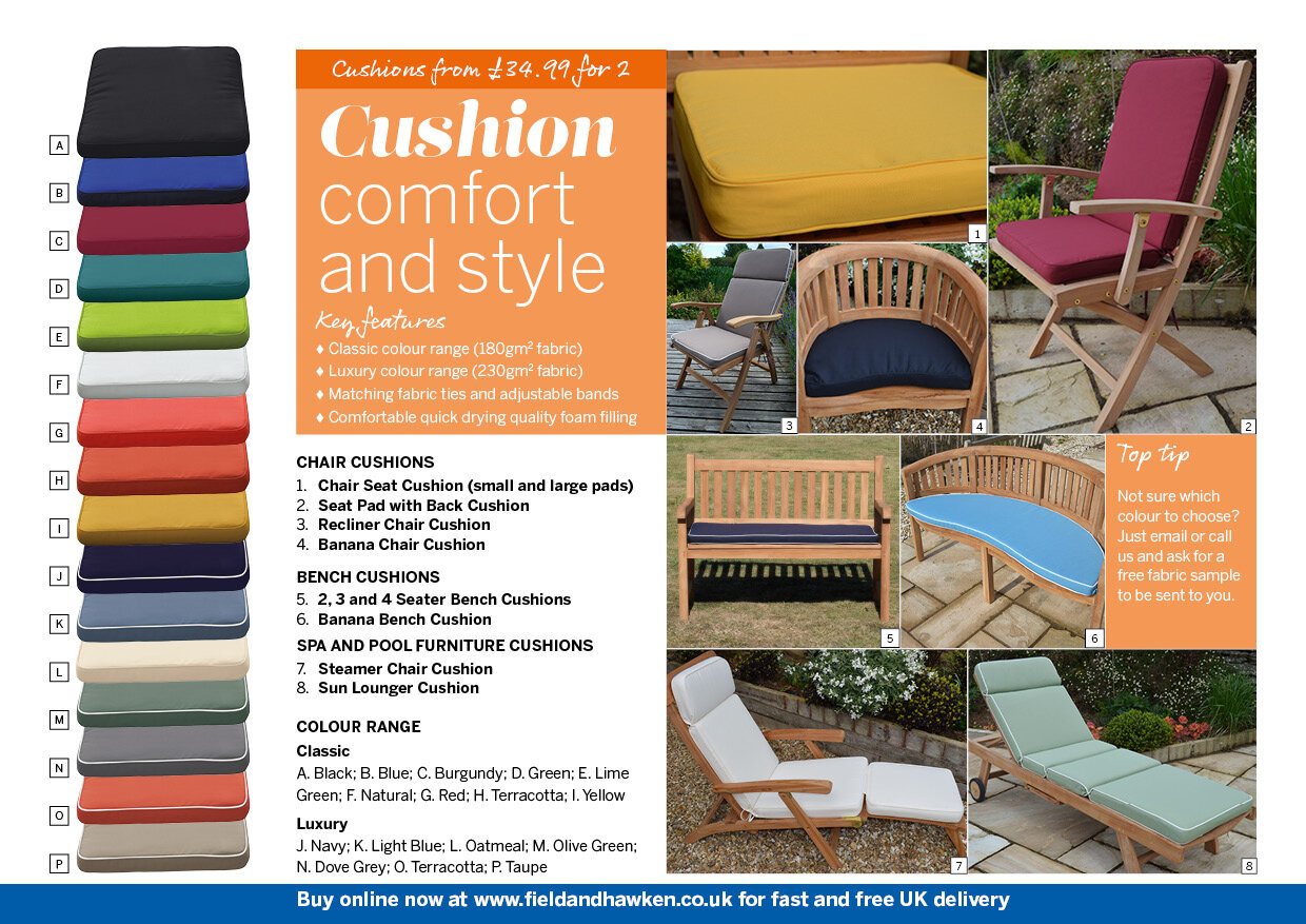
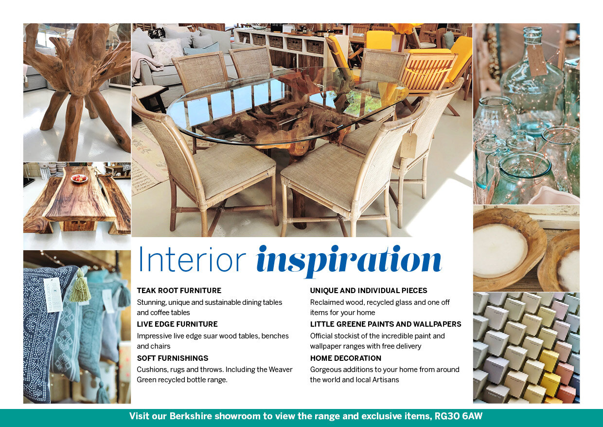

The brief required a document which could be adapted for on screen and printed versions, and which caters for both B2B and B2C use. To achieve this I ensured that each page would work both on its own for on screen viewing and within a double page spread for the printed version, and that each page would be self-contained. This on-screen version is being launched first, hopefully with a printed version to follow soon.
It’s too early to see concrete results from the project, but the feedback from the client is very positive:
Having worked with Steve for many years there was no doubt who we would trust to help us create our first full brochure. Steve brings a wealth of experience, creative ideas and positivity to projects to create something that demonstrates our company objectives, products and service in a single document.
Andrew Field, Director, Field & Hawken

