Designing notebooks for good with Save the Children
The brief
I was briefed by members of Save the Children’s fundraising and marketing team, to design a set of notebooks for their supporters to sell in online shops on Save the Children’s Good Goods website. Proceeds will go towards educational and other materials to children around the world.
As this was the first time they had sold notebooks via Good Goods, with different designs intended to appeal to adults and children.
The designs needed to incorporate Save the Children branding while appealing to consumers who weren’t necessarily supporters of the charity.
Research
Stationery is a very trend-driven industry, so I started by researching current trends relevant to the brand. I also looked for education-related imagery and themes intended to be inspiring and fun rather than feeling too worthy.
Designs
After exploring various routes, the fundraising and marketing team gave the go ahead for a set of five designs. Quotes were a popular trend from my research, and the fundraising and marketing team supplied an inspiring quote from the charity’s co-founder to incorporate into the design, in order to make the design relevant to the charity’s purpose.
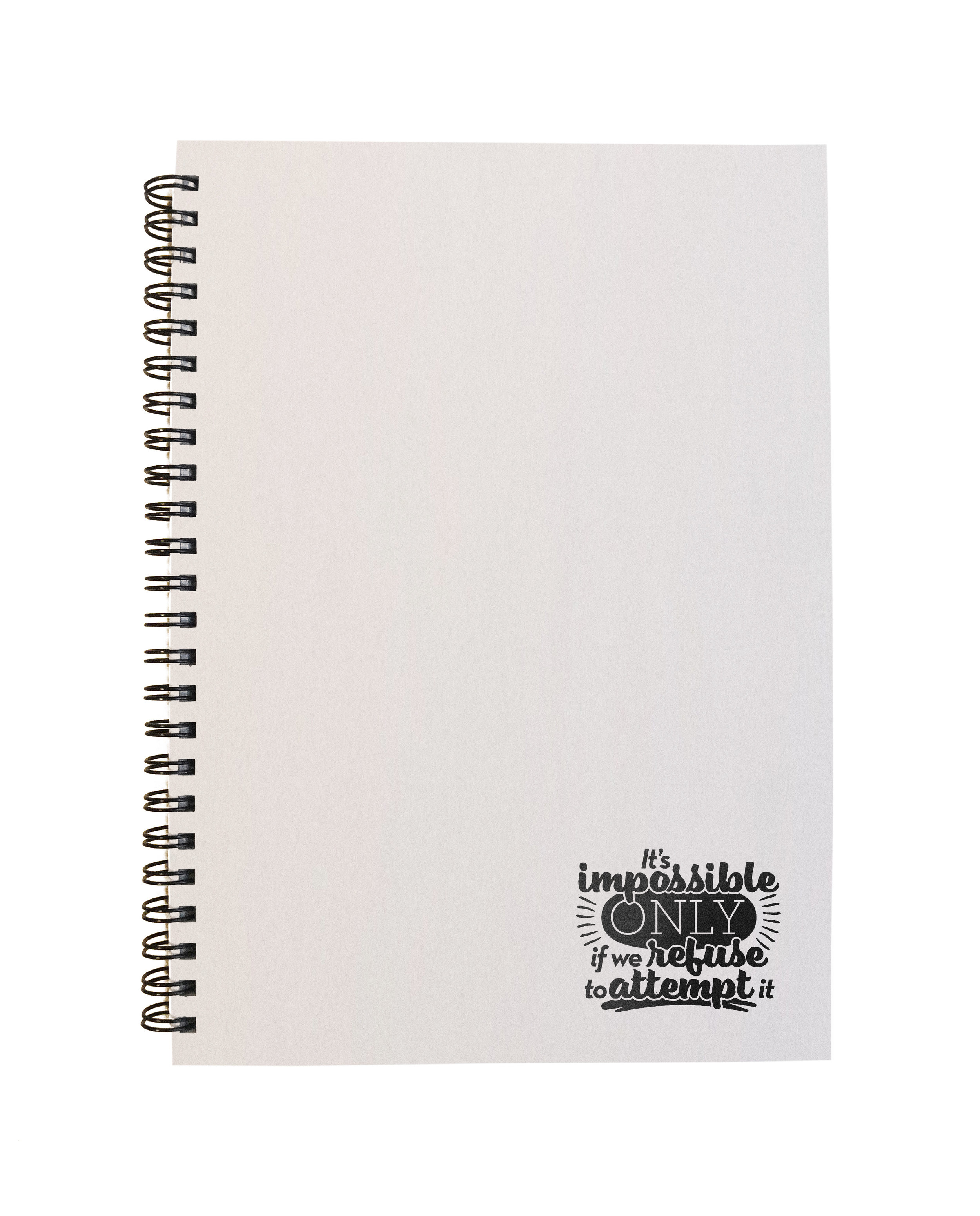
I created a loose typographic lockup of the quote, which was then applied to four adult designs: a pencil sketch option which I drew, two classic embossed premium notebooks, and a more minimal white spiral-bound design.
The quote was then adapted into a more superhero-style soundbite for the kids version of the notebook, and I developed a bold graphic design which incorporated colours from the Save The Children brand palette.
I also designed Facebook carousel ads to encourage people to set up online shops selling the notebooks, and created photorealistic product mockups.


