A dynamic identity for a dynamic climate
This project was undertaken by Sharp Sharp Director Steve McInerny working as an associate for BrandCentred.
The challenge
Insurers Ventus were well respected in their specialism of coastal catastrophe insurance in the US, and have developed innovative tools for assessing risk. Their branding and visual identity didn’t reflect the ambitions of the business, so there was a need to refresh and expand the branding for this growing business.
BrandCentred was commissioned to develop new brand positioning, visual identity, tone of voice guidelines and to apply the brand to a wide range of materials. Steve’s responsibilities within the project included creative direction of the visual identity, development of brand guidelines and brand assets, and designing a range of branded materials. He worked closely with BrandCentred’s creative, strategy and copywriting project team.
The response
Steve joined the project while the brand positioning was in development, and started out by conducting visual and competitor research, and a set of moodboards based around three potential brand territories. The visuals helped to stimulate initial reactions from the client team, and to inspire the project team and unify its vision for the brand.
Responses from the mood boards, along with inspiration from nature and architecture, fed into an initial set of visual identity concepts. A wide range of options were developed internally, these were winnowed down to a set of five options presented to the client. The core brand positioning was defined as ‘clear, confident, controlled’, and a set of concepts was selected by the client.
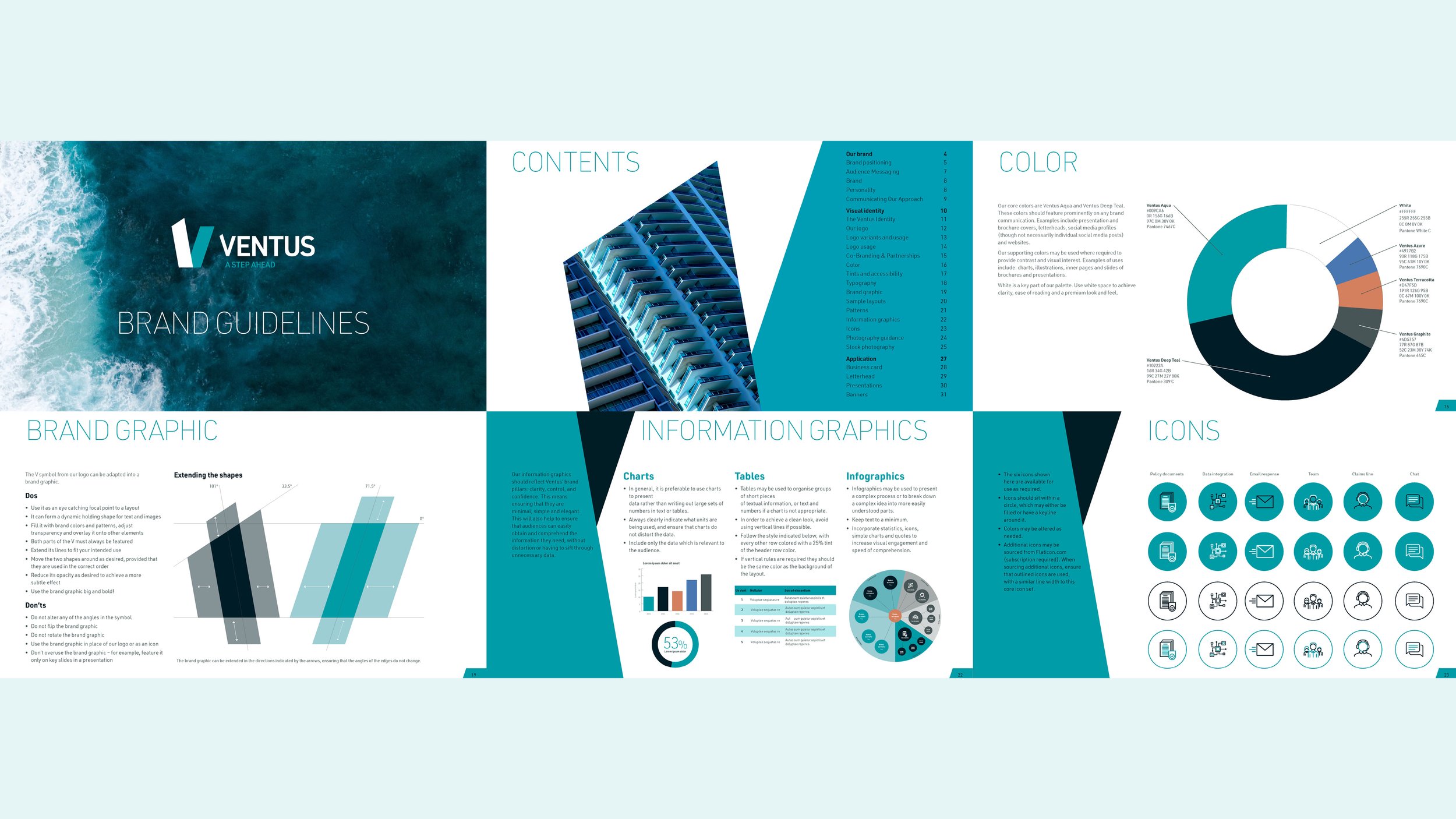
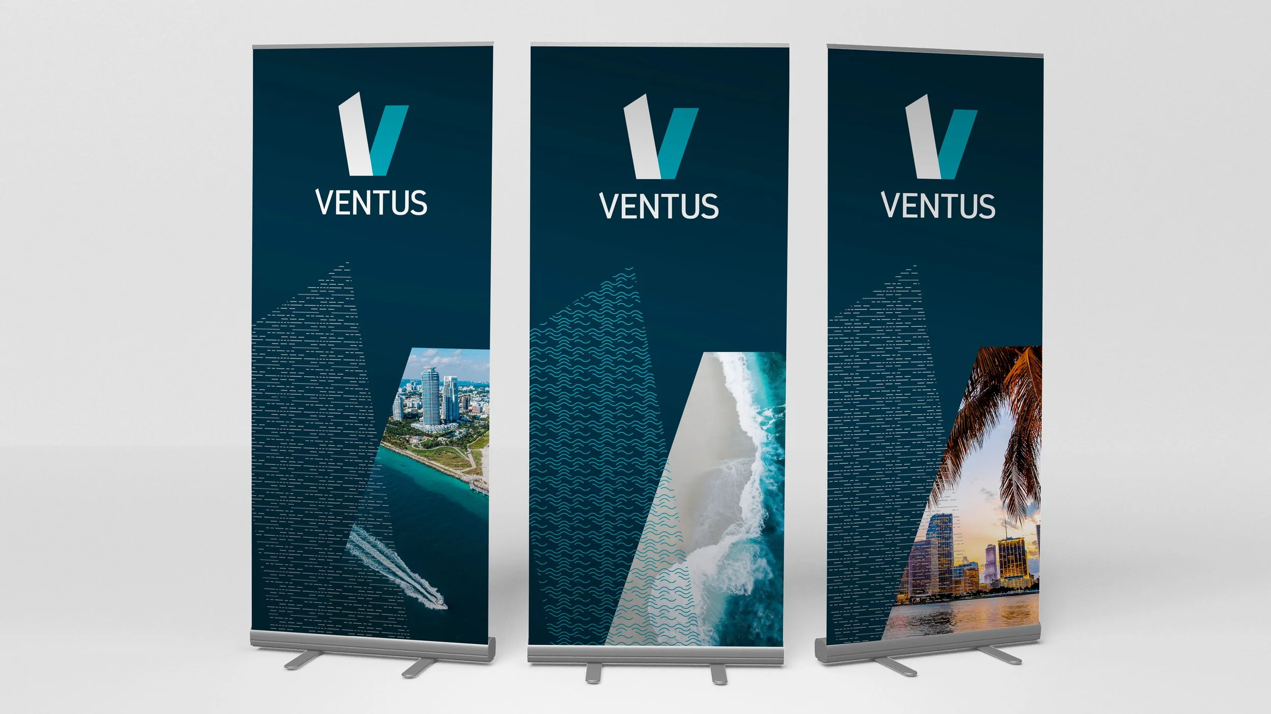
The logo was refined into a dynamic yet geometric and precise V form. A businesslike teal and deep blue formed the core colours, which also nodded to the coastal locations and architecture which Ventus protects, and the natural forces it insures against. This V form provided the seed for the visual identity, which Steve built out with a suite of brand assets including a brand graphic, patterns and animated logo. Steve also designed and co-wrote the brand guidelines document.
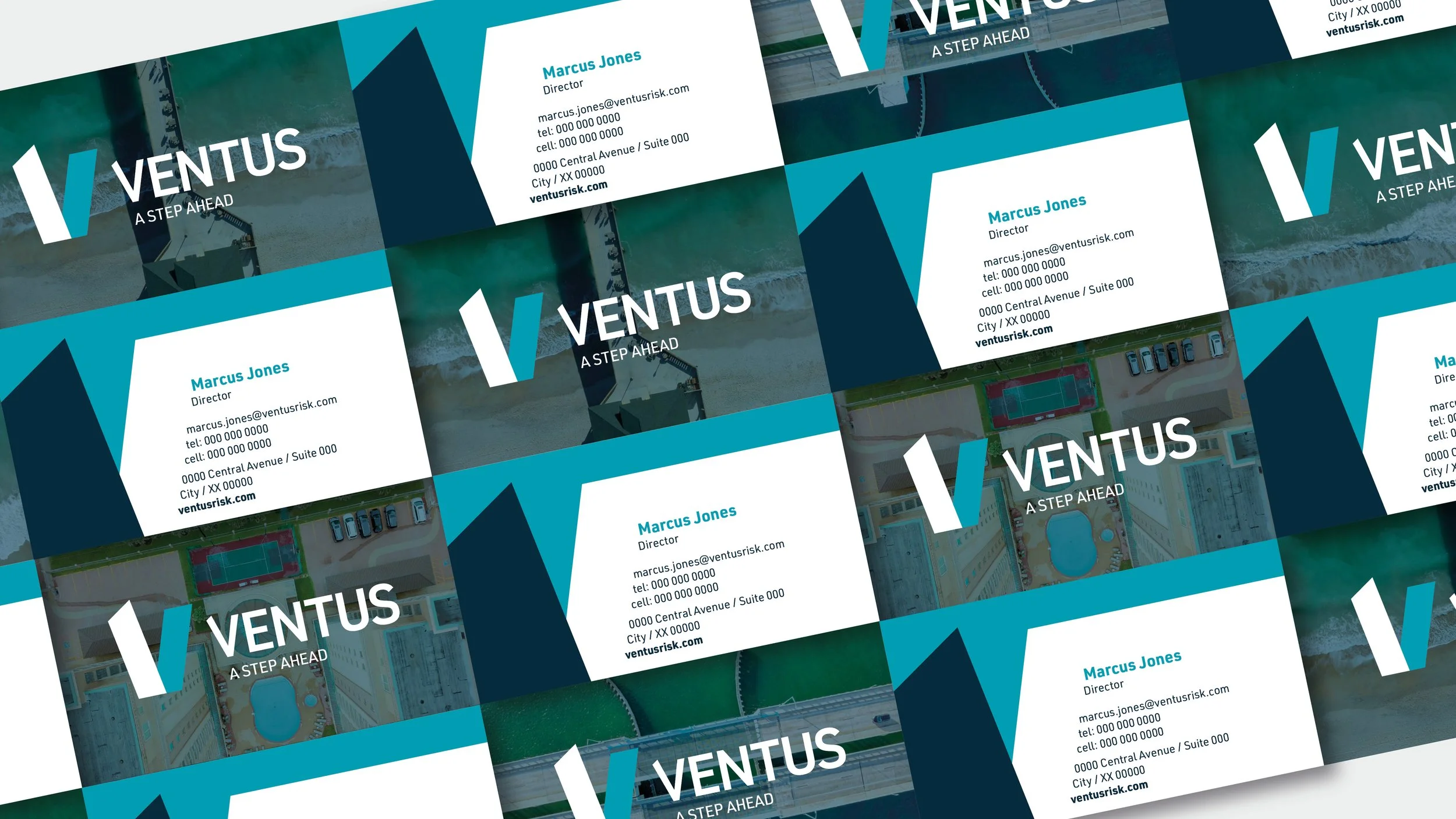
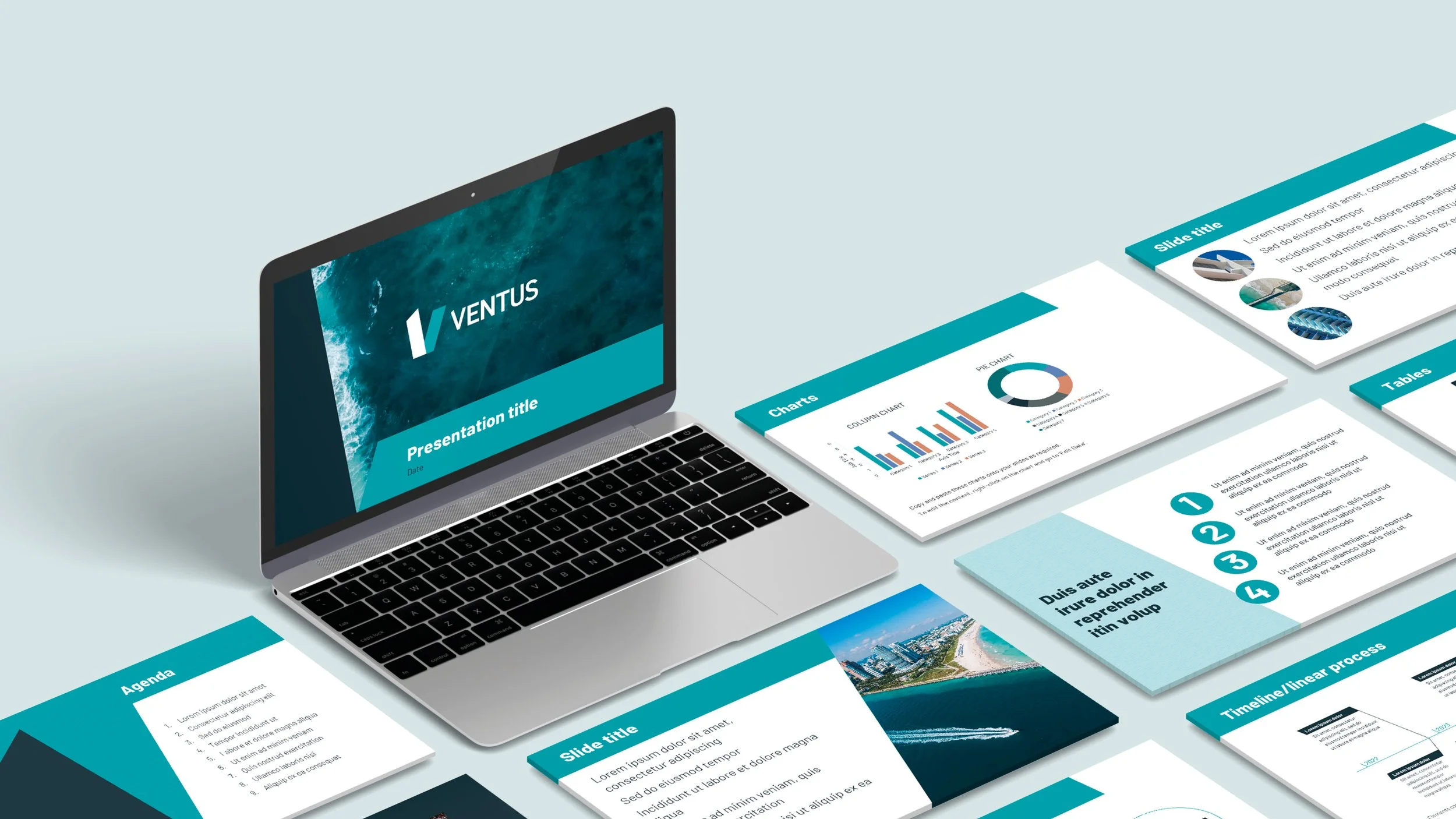
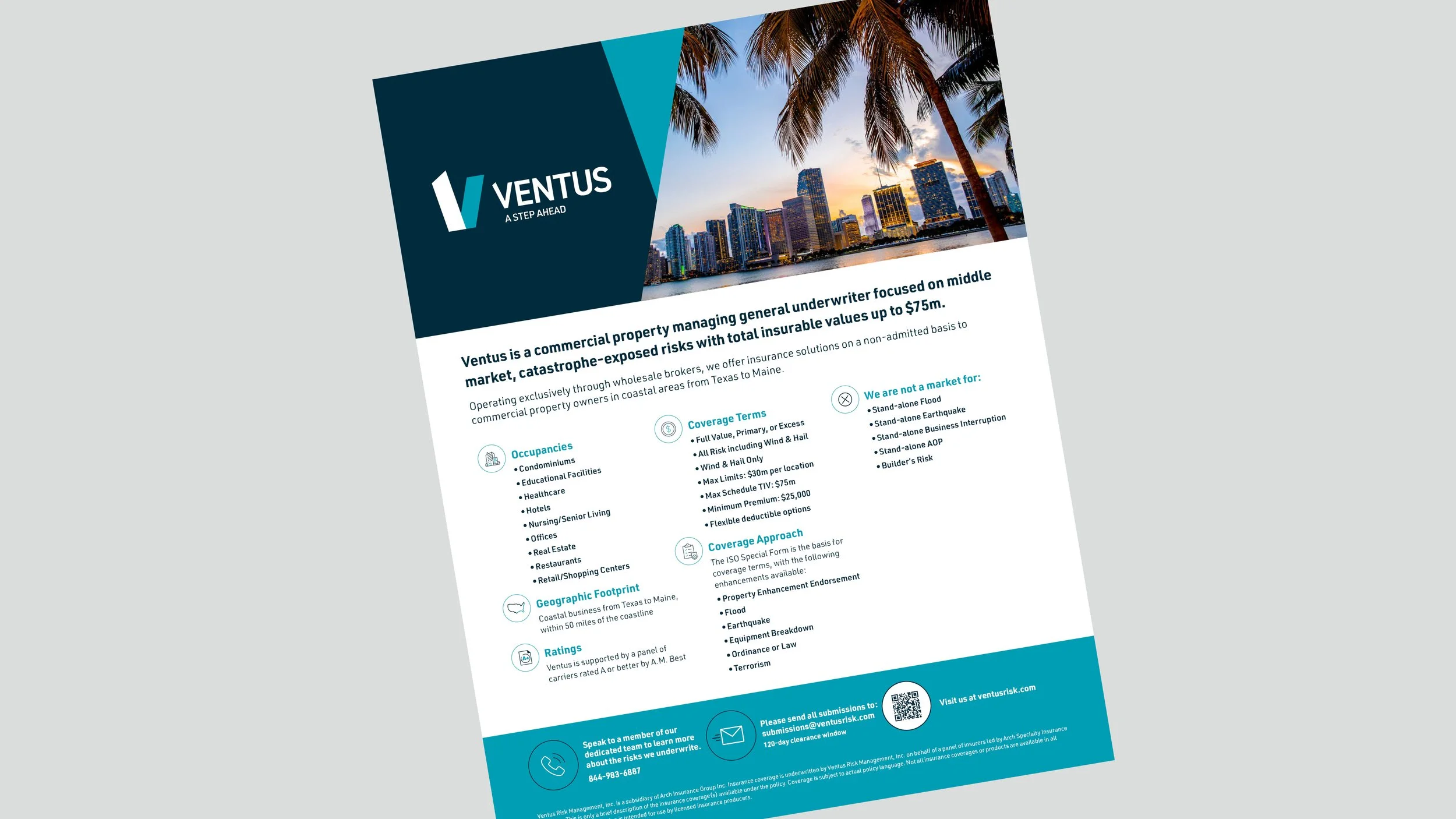
BrandCentred then developed a kit of branded materials for Ventus. Steve’s tasks at this stage included designing a range of branded templates for presentations, sales and marketing documents and digital and printed stationery. He also wrote guidance on their usage for the Ventus team, taking into account the software available to them and their level of design expertise.
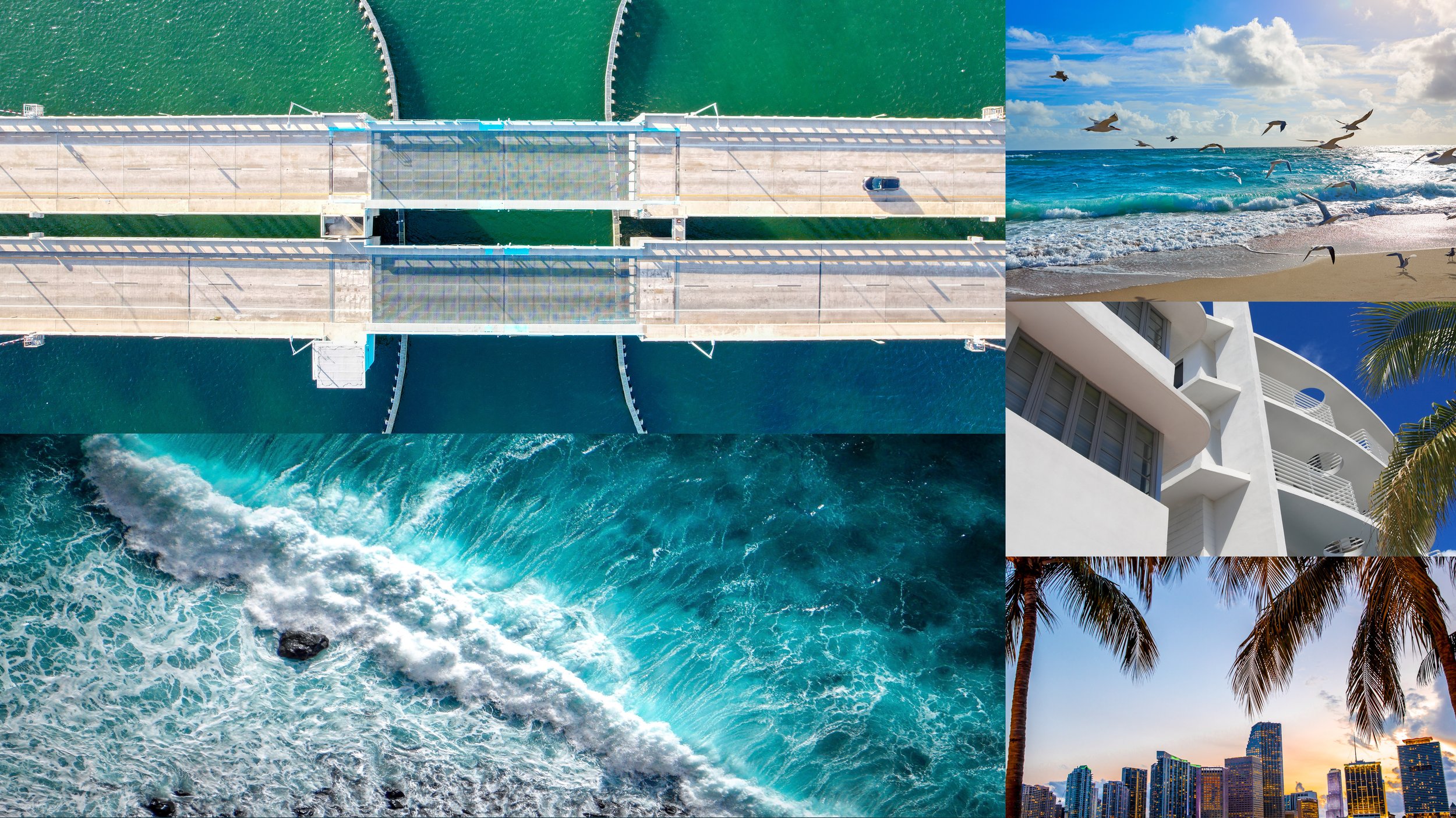
Aerial photography of the US coast and coastal architecture was incorporated into stationery and other elements, inspired by the satellite imagery which Ventus uses in its suite of risk assessment tools.
Results
The new brand has been rolled out by Ventus across its five locations and its online presence. It has been well received by clients, internal team and its parent company, Arch Insurance.
“Steve's balance of creativity and rigour throughout the identity development process ensured we brought the Ventus brand personality to life. As a result, we delivered a suite of impactful communications based on clear guidelines that will help build a consistent and compelling brand for the future.”
Ed Horrocks
Director, BrandCentred

