Putting character first
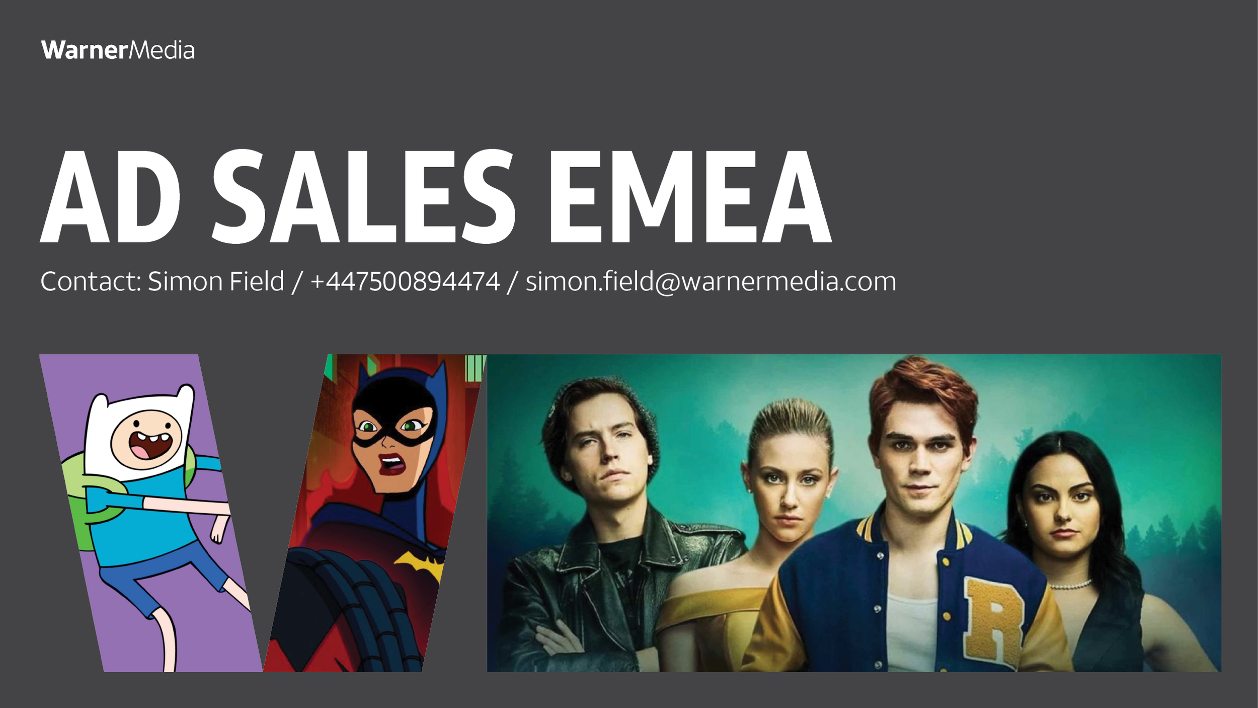
This project for Warner Bros UK’s ad sales team was a welcome chance to work with their top-drawer kids content including Scooby Doo, Adventure Time and DC Kids.
The brief
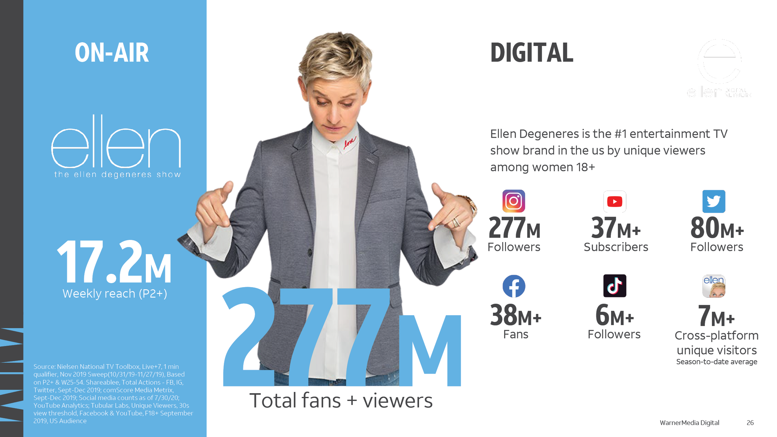
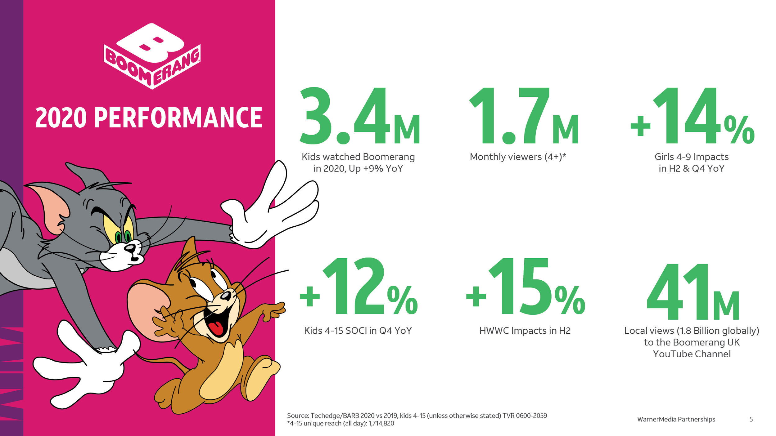
The team had a wide variety of case studies, research and ratings presentations from across WarnerMedia’s European channels, however they had been designed at different times with different branding and for different channels. Warner Bros UK’s Creative Services team asked for support to develop a coherent design system and to refresh the design of this suite of presentations.
What we did
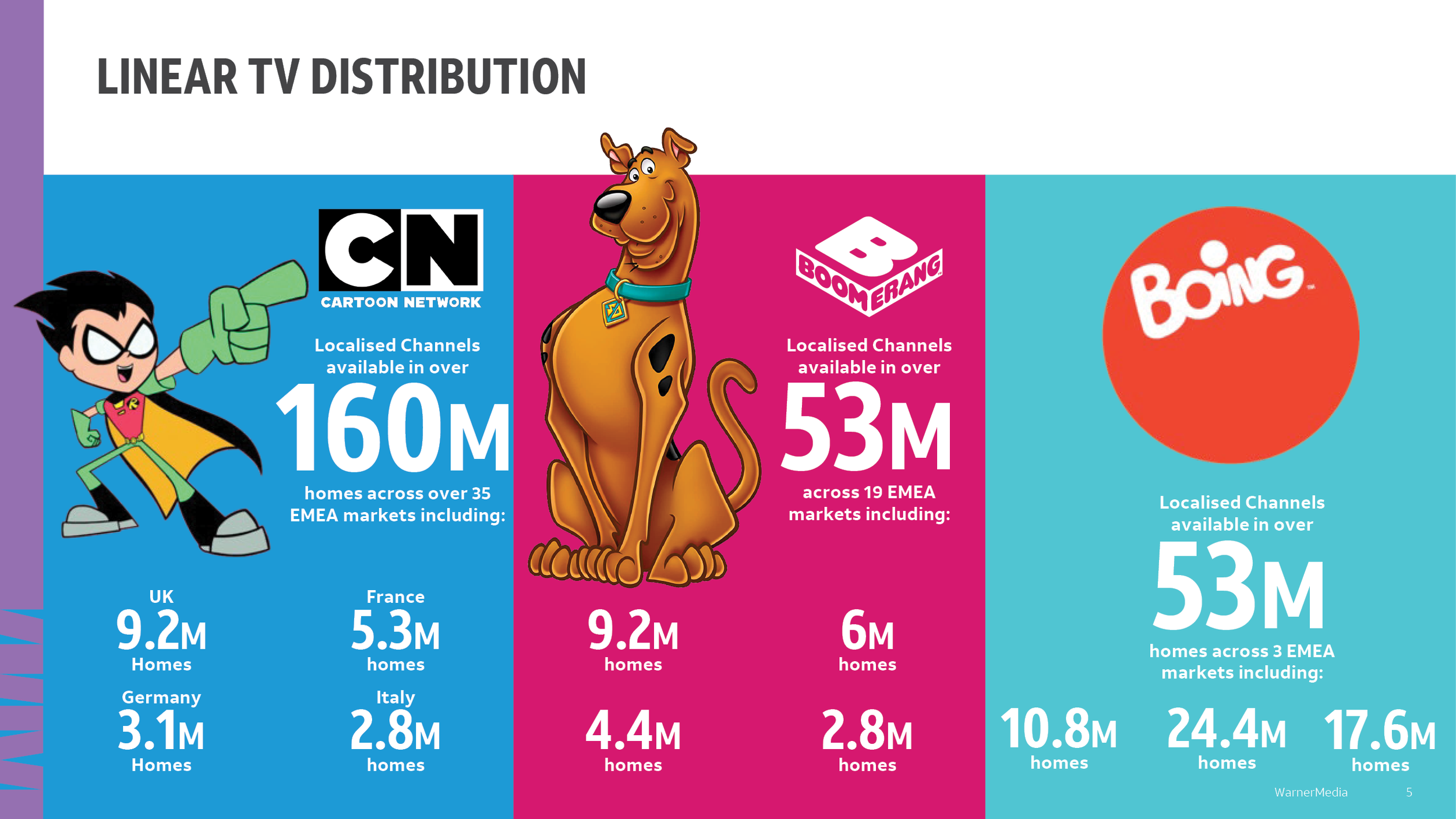
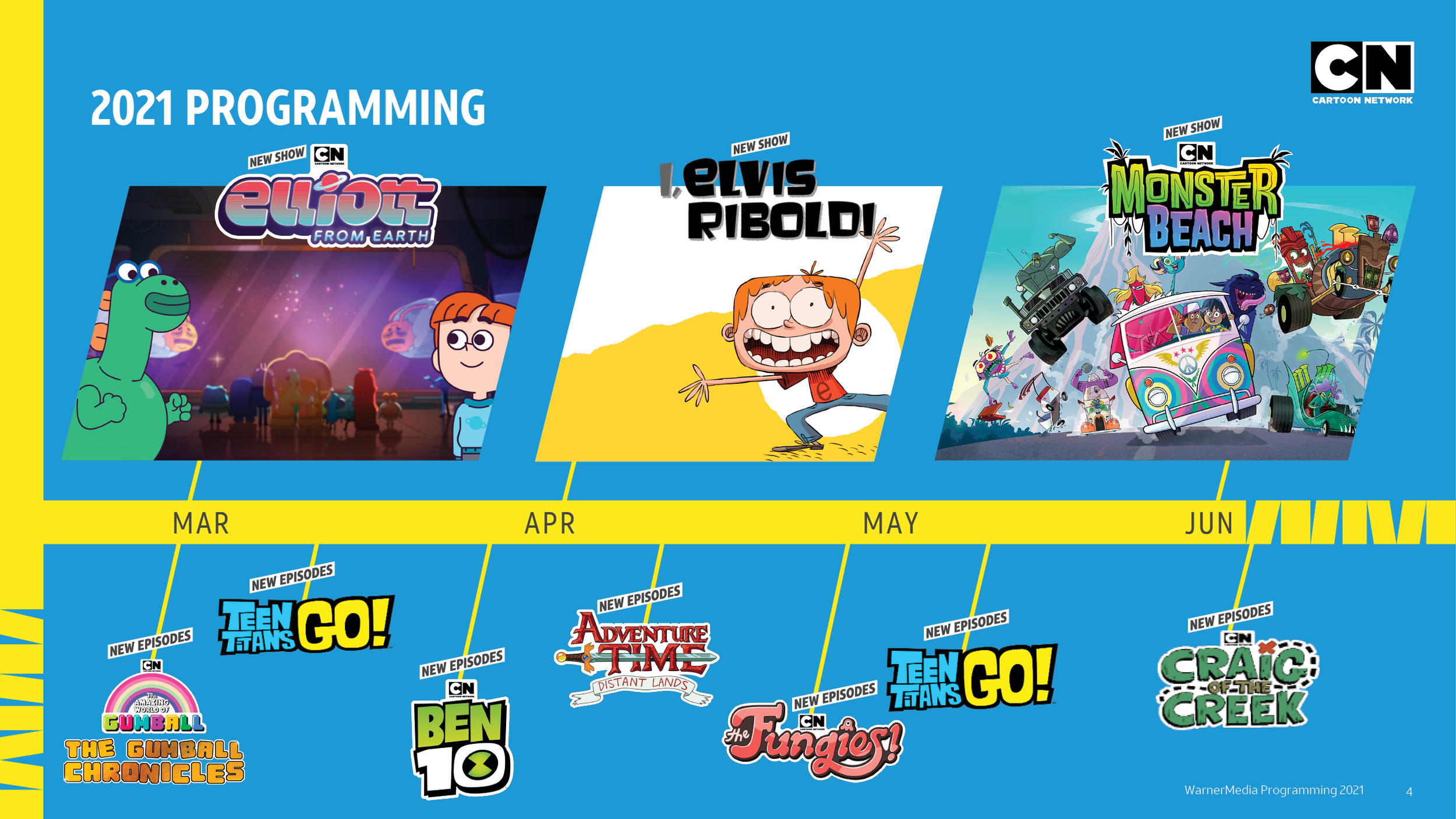
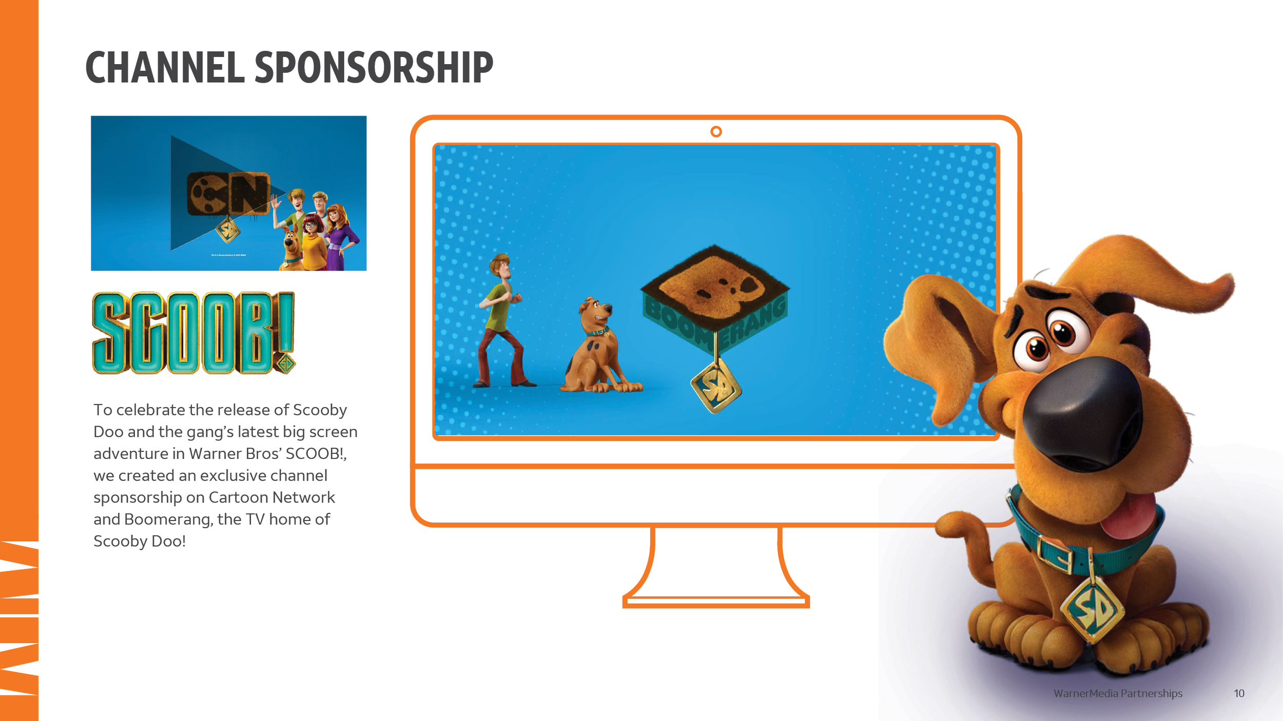
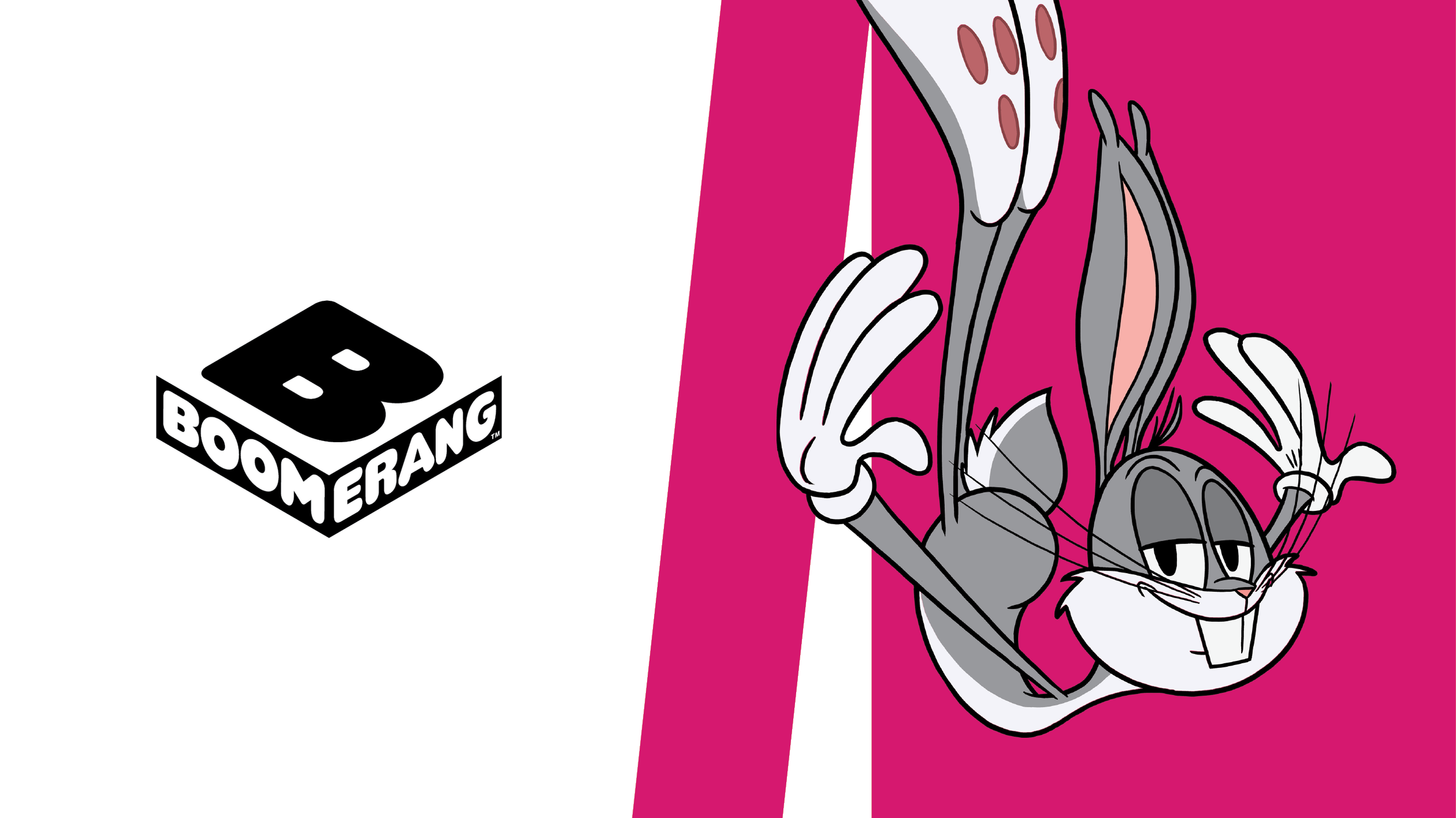
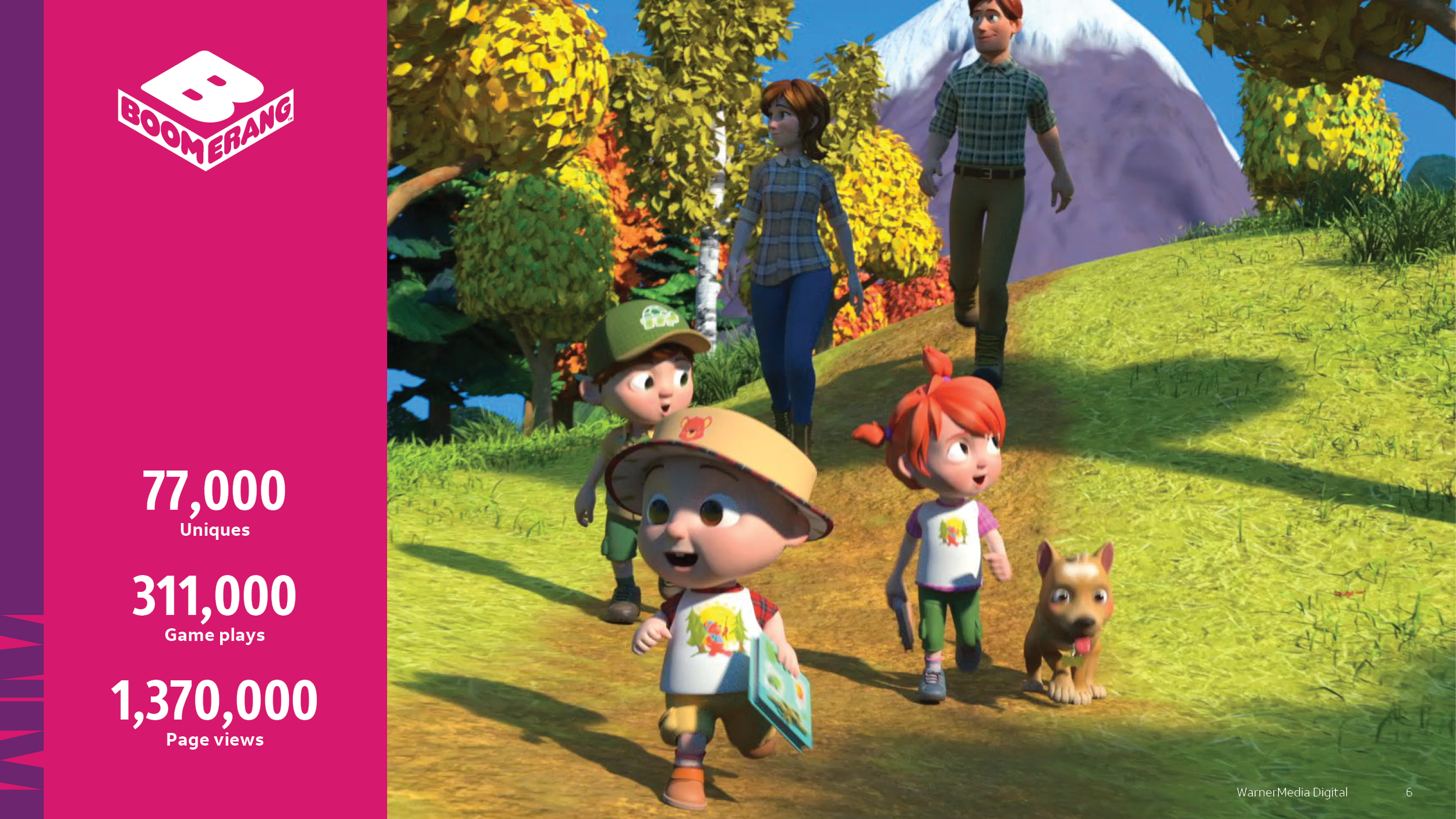
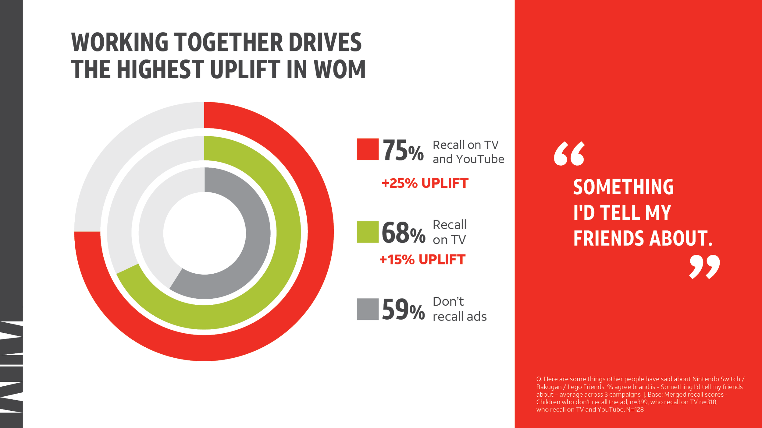
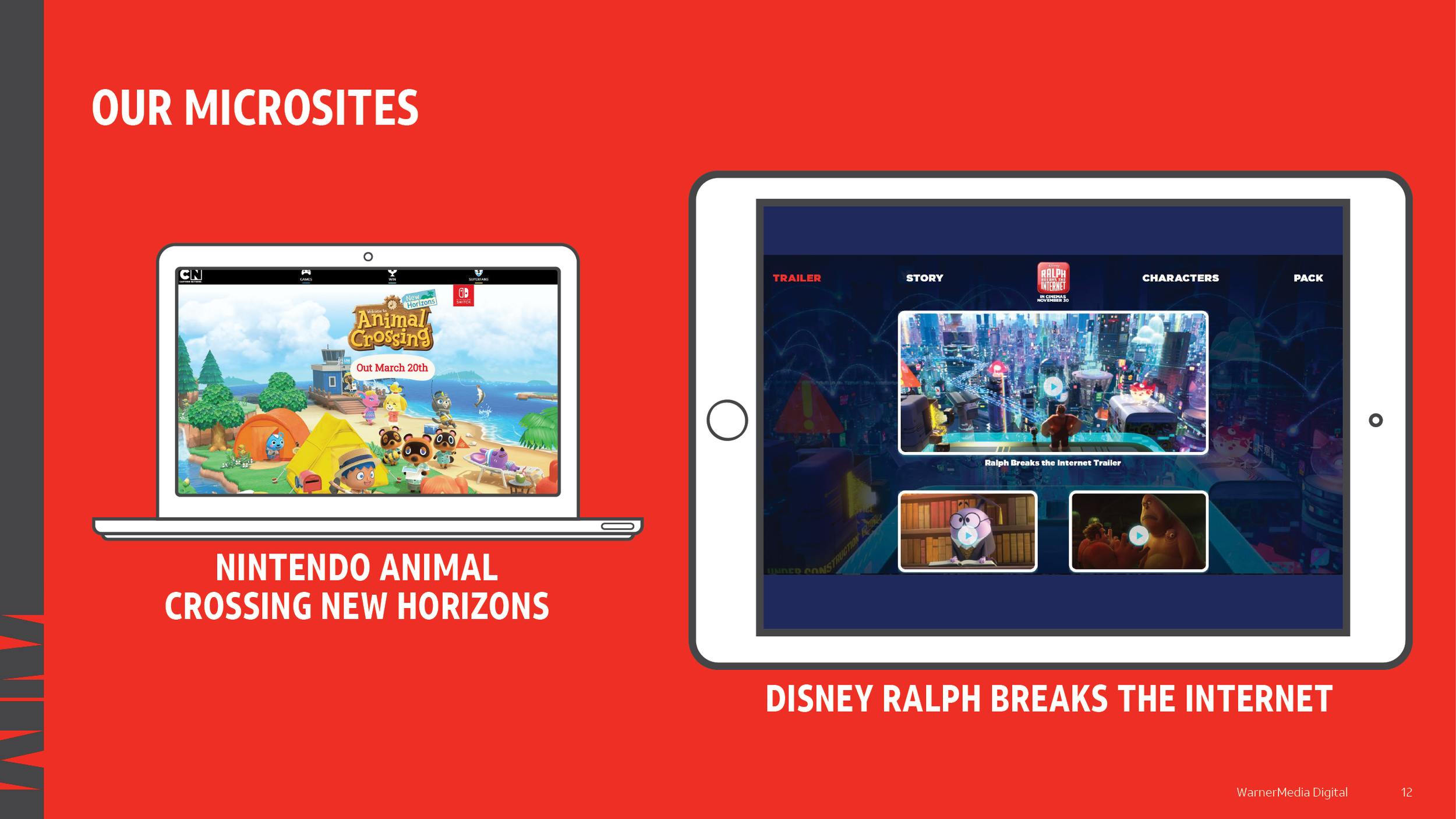
We started out by reviewing the content and various pieces of branding in use, and conducting some competitor research. In discussion with Warner Bros UK’s Creative Services VP, and his internal client from the ad sales team, we decided to strip out the unnecessary layers of branding in use and to sit all of the presentations under the WarnerMedia master branding. We nodded to WarnerMedia’s channels by incorporating their colours into some of the slides, and made good use of WarnerMedia’s vibrant secondary colour palette in order to best present the largely kids-focussed content.
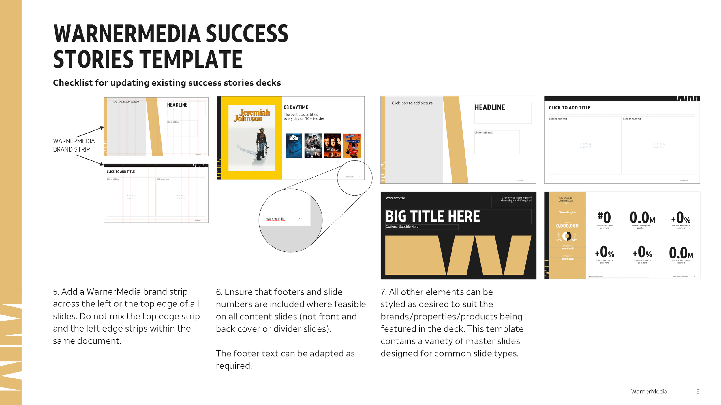
We made use of WarnerMedia’s existing templates where appropriate, and added new ones in order to make the presentations less corporate and more sales- and content-focussed.
Once the system was in place then updating the design of the presentations was straightforward and speedy. We left the ad sales team with a full suite of templates for future use, along with full instructions.
The ad sales team were very pleased with the results, and plan to add the presentations to their B2B website in due course.


