On the case with the TV detectives
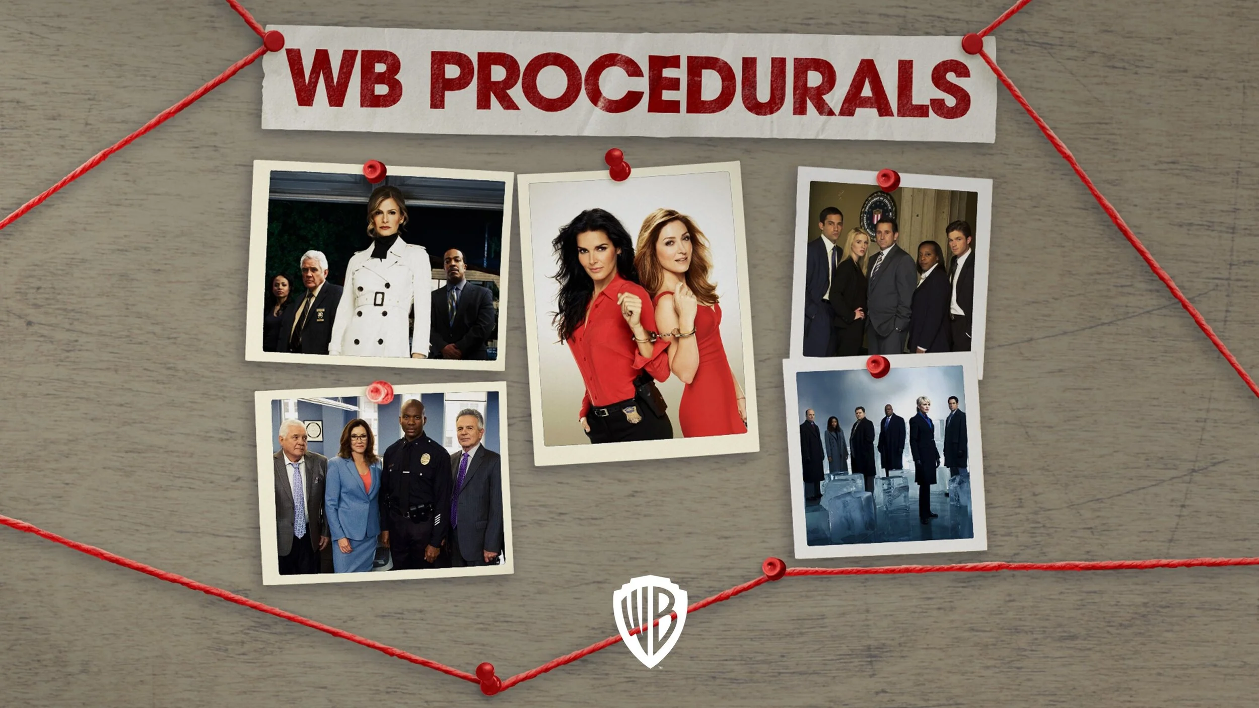
I was briefed to evoke the largely pre-digital world of old-fashioned police work in this presentation of Warner Bros’ crime procedurals collection.
I did this by incorporating imagery of line ups, case files and an investigation wall, and a gritty overall look and feel. This approach, along with an emphasis on imagery over text, helped to make the presentation feel less, well, less like a presentation.
The investigation wall was a key element, I animated it in order to lead the viewer through the presentation by following a red thread pinned to the wall.
Each show is presented as a case file, and promo videos were added to give viewers a flavour of each show.
Presentation design work often doesn’t get much love among designers, but is an area I enjoy getting stuck into. This one was a welcome chance to try something different and keep it very visual.
Visuals: copyright Warner Bros, reproduced here with permission from Warner Bros UK.


