Building a brand for kids who like to yakka yak
TV show Yakka Dee! helps pre-schoolers learn to talk. Sharp Sharp’s Director Steve McInerny writes: “I can attest to this, having seen my daughter copy Dee as she says new words in the show”. It’s a big hit on CBeebies and on YouTube, with over 200 million views on YouTube alone.
The brief
Now the show’s creators King Banana and animation studio Beakus, together with Rocket Licensing, are developing Yakka Dee! into a fully-fledged licensing brand.
A licensing style guide was needed in order to help sell the brand in to licensees, and provide them with the assets needed to develop products. King Banana and Beakus entrusted Sharp Sharp to create the guide and develop new assets. After conversations with King Banana and Beakus, researching competitors and existing licensed products, Sharp Sharp developed a creative brief and list of deliverables best suited to the target categories.
In short, the brief was to find a way for Yakka Dee’s personality and unique ‘learn to talk’ appeal to stand out in a landscape dominated by a few large brands.
The solution
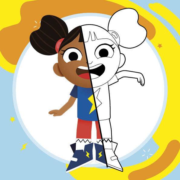
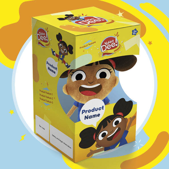
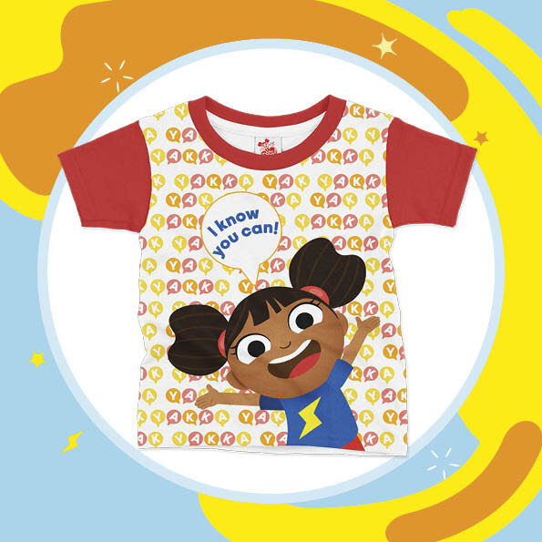
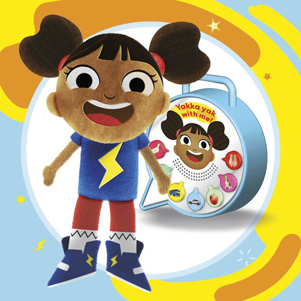
With the Festival of Licensing coming up only a few weeks after the brief was agreed, the immediate priority was to put together a suite of assets and taster style guide which could be shown to licensees. Channelling Dee’s can’t-sit-still energy, Sharp Sharp got to work, putting Dee and the love of talking at the centre of the brand, and collaborated closely with its art director Chris Allen to bring the show’s cute but cool illustration style off the screen and into the real world. The initial assets included bright and bold packaging, learn-to-talk product concepts as well as placement designs for apparel.
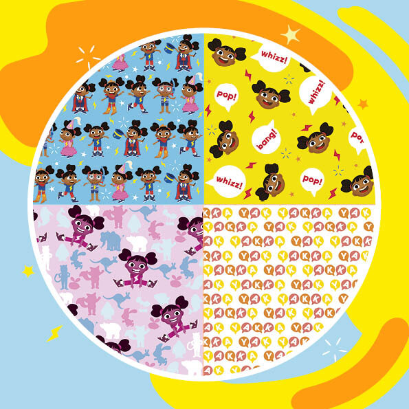
The ‘whizz, pop, bang’ energy of the show was captured through the use of a bright yellow core colour, plus bold flat graphics which whizz and fizz around the pages.
The Festival of Licensing was a valuable opportunity to get feedback from licensees about the taster guide, this was incorporated into the development of the full guide. Read our report on trends from the show here.
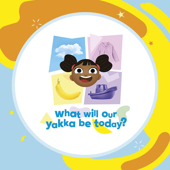
The full 40-page style guide was a chance to incorporate more of the show’s huge cast of characters and off-the-wall style. The characters provided light relief among the more instructional (but very important) sections of the guide, which cover everything from what Dee says to how she looks, colour palettes, typography and logo use.
Over 175 brand assets were used in the final guide, including packaging, backgrounds, placements, logos and illustrations. Sharp Sharp paid close attention was paid to details such as colour correction and retouching of characters, to ensure that Dee will look her best, whether she shows up on a pair of socks, a toy box or a book cover.
The results
Yakka Dee! is already appearing in licensed publishing products, and gathering interest in other licensing categories. We look forward to working with Dee again as she takes on the world!

