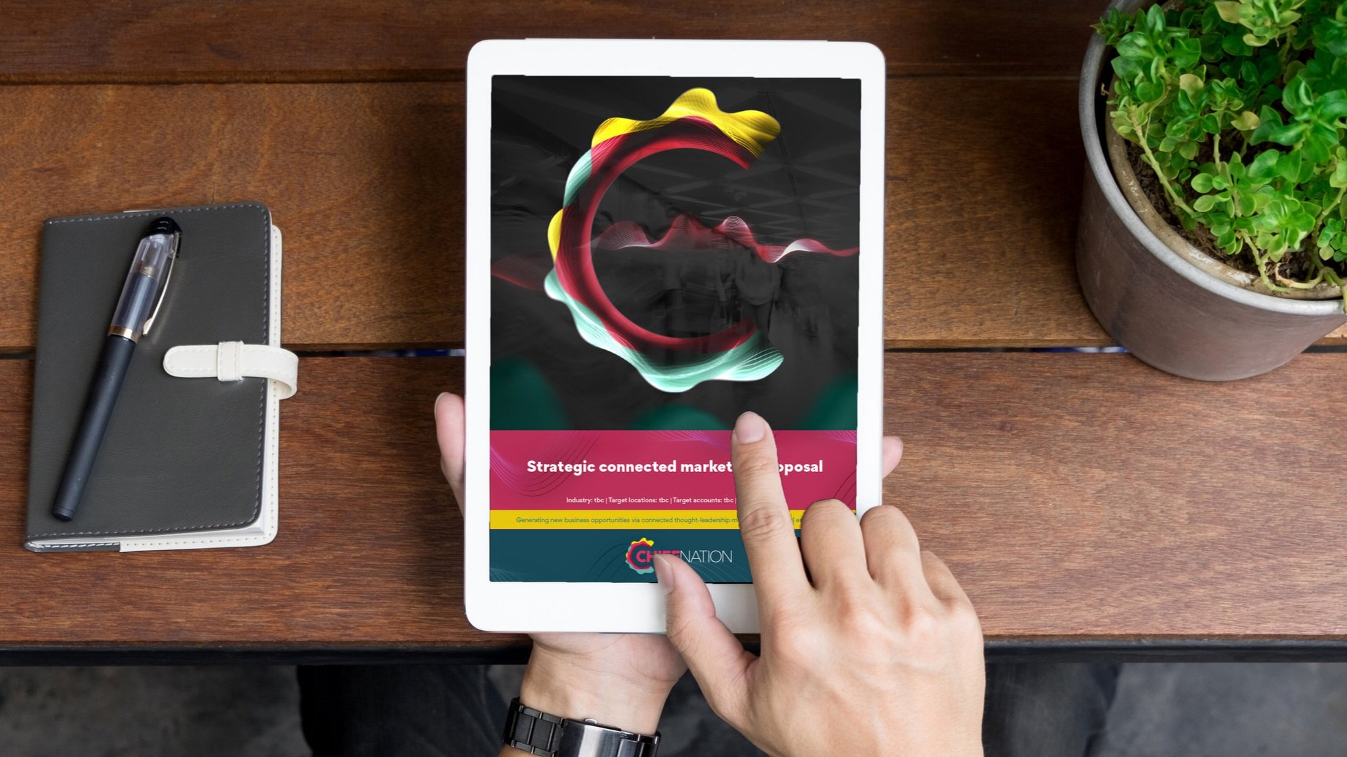
Having created branding for a number of marketing agency Chief Nation’s products in the past, it’s been a real honour to get to rebrand Chief Nation itself. Doing so amidst the upheavals of global lockdowns meant that this was my first remote rebrand, an unexpected challenge.
In many ways it was a really good time to rebrand, as it was a chance to position the business at the forefront of the new ways we communicate.
Brand positioning
The existing branding was functional but wasn’t memorable enough, and it hadn’t been refreshed for some time.
After mapping out the project with the directors, I organised a short workshop with staff from across the business in order to get their insights on competitors, where they perceived the brand was at that point and where they wanted to see it go. This fed into an in depth session which I led with the directors to decide upon the core brand positioning.
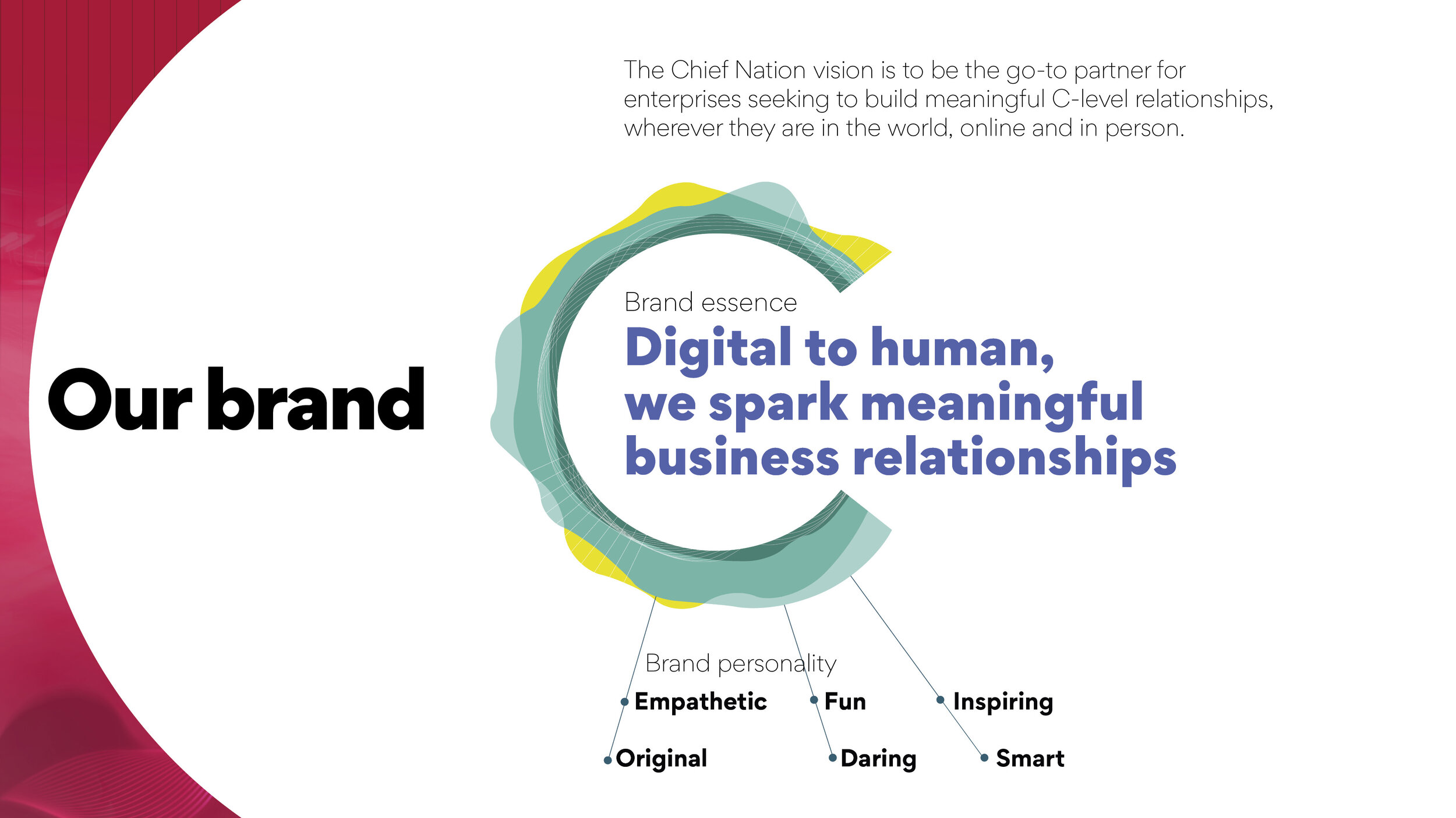
This was honed into a central brand purpose statement: ‘digital to human, we spark meaningful business relationships’. This reflects Chief Nation’s emphasis on building human connections through live and virtual events. I then developed a creative brief for the brand design, based upon the key elements of the brand positioning.
Design
I start out by thinking in words rather than pictures, to avoid going down a very specific route too early and to ensure that there is a concept behind the visual execution. I then developed a few initial routes, which focussed on slightly different aspects of the brand positioning. The selected route developed out of posing myself the challenge to visualise a conversation within the brand design.
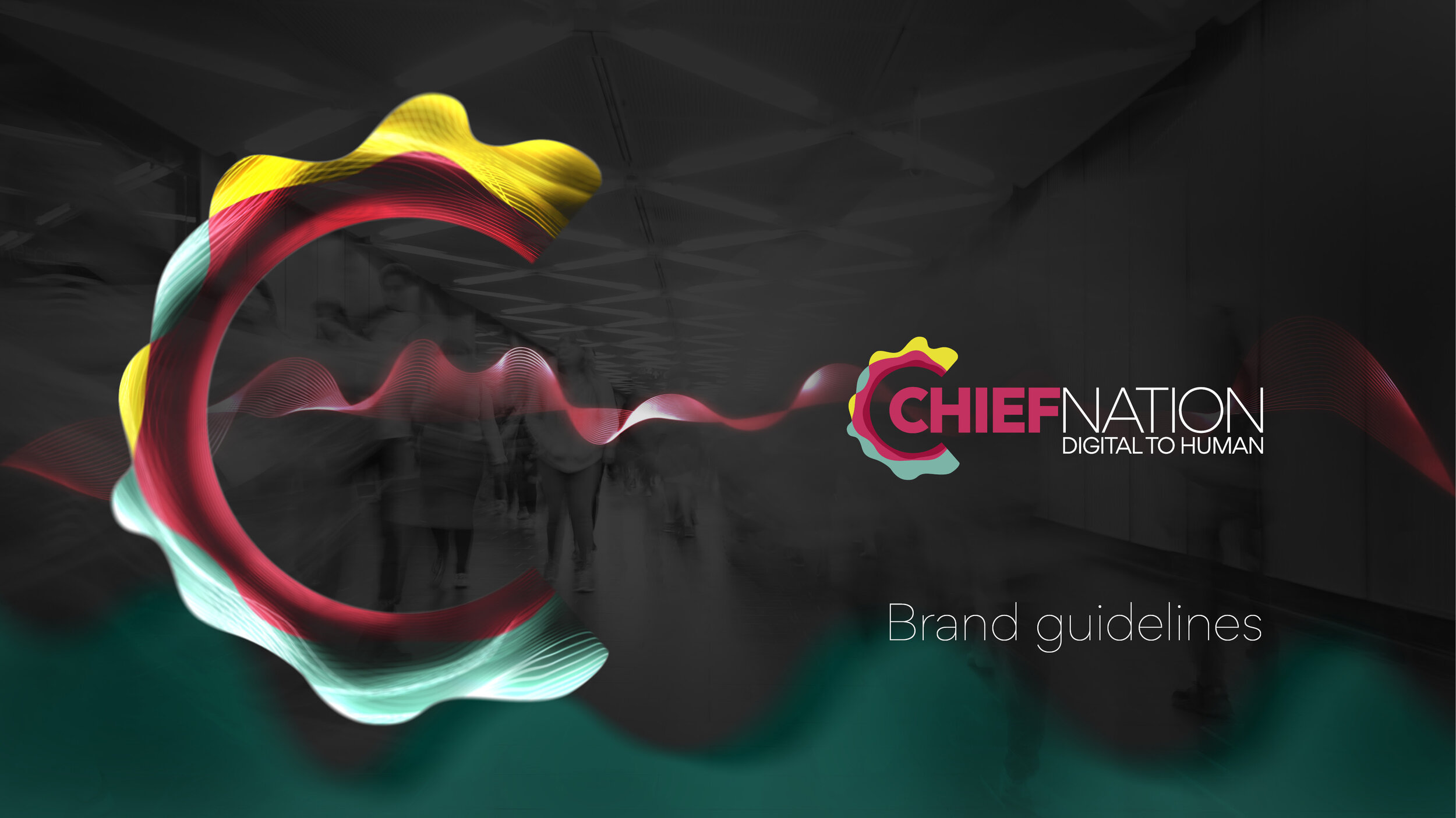
This was followed by sketching out by hand a wide range of logo designs before finally moving onto the computer. In my visual research I found lots of promise in audio visualisations, and these inspired the logo design.
I worked closely with the directors to fine tune the logo over a number of iterations, and incorporated their input into typeface selection and the styling of the graphic elements. A fresh, geometric typeface was selected, which I customised slightly in order to make the ‘C’ match the angles of the C icon within the logo.
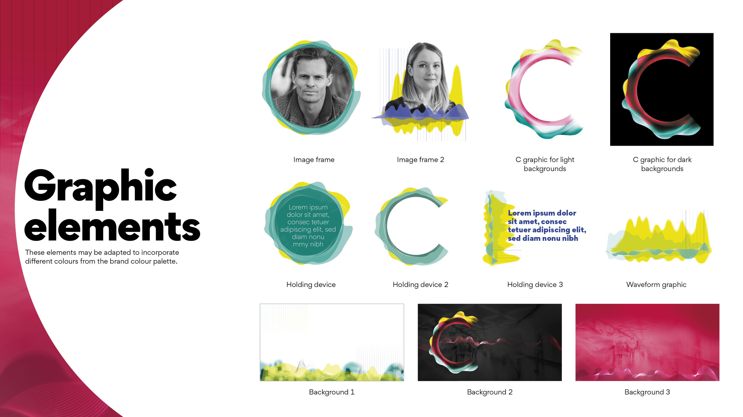
Opinions differed along the way which I welcomed, and think is healthy in the creative process. This was resolved in a constructive way, and helped to produce a more crafted end result. I obtained voice recordings from each of them which I visualised and incorporated into elements of the branding, though it was decided not to use waveforms based on their voices into the logo itself.
Photography for the technology industry marketing materials is typically very artificial, ‘stocky’ and often a little generic. To stand apart from this I prioritised featuring people in the photography, to best reflect the human emphasis in the brand purpose.
This photography was then made uniquely Chief Nation in feel by adding in waveform elements and tinting it with the brand colour palette.
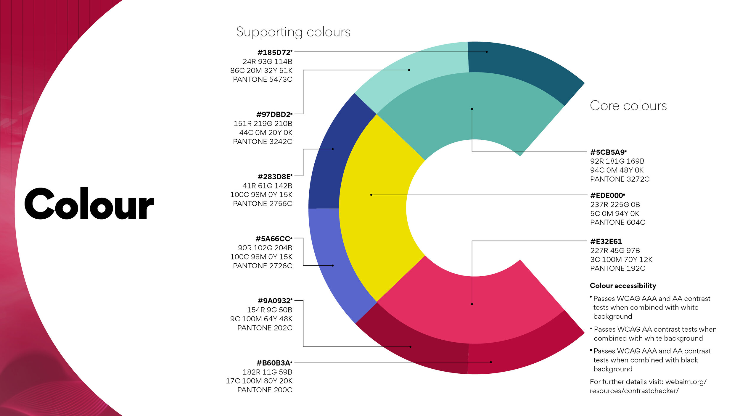
I developed a concise brand guidelines document, and developed a set of supporting brand elements which can be further customised by the client.
Brand expression
I developed mockups of some key branded materials in order to ensure that the branding would work ‘in the wild’, as well as to provide inspiration for when Chief Nation’s in house designers start to use the branding.
The unveiling and handover of a new brand design is vital in order to get buy in from employees as well as to instruct them in its use. I liaised with the directors to help them make the reveal a success, and then talked the in-house creatives through how to use the brand.
Results
The directors were so keen to use the new positioning that its messaging was incorporated into new business pitched before the branding was completed. This helped by providing vital customer feedback in real sales situations. The new human-focussed positioning has already helped to generate new business, and is testament to the business value of branding.
The design has been well received by Chief Nation’s clients. The Chief Nation team’s pride in the new logo was attested to by the way they promoted the launch heavily online, including a five day countdown to the launch which - a pleasing first for a branding project which I’ve created!


